Oscar's new logo design
December 19th, 2013
Oscar is the man that every actor wants on their mantlepiece. A gold statuette awarded by 6000 members of the Academy for Motion Picture Arts and Sciences is considered the top accolade for not only actors, but screenwriters, directors, producers, score composers, special effects teams, animators and more.

Ahead of the announcement of the 2014 Academy Award nominations on January 16, the Academy has also announced a new logo design.
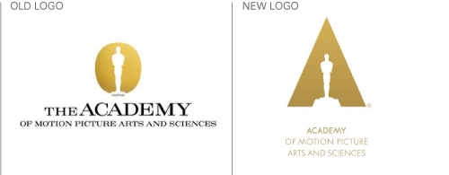
Although it has not changed much from the previous incarnation, the subtle changes to the new logo are clever.
Instead of being silhouetted by a gold oval shape, Oscar is now surrounded by a gold triangle, which emulates the letter ‘A’ for Academy, and illuminates the coveted gold statue under a spotlight.
According to British designer Richard Harrington from 180LA, the company that worked on the new logo, the aim of the new design is to “transform the visual balance from not only representing the Oscars, but … [also to include] the Academy.”
Best known for its annual, all-star Hollywood awards celebration, the Academy also organizes events and exhibitions, offers grants and support to aspiring actors and movie-makers, and holds records and archives. It also carries out research into the history of cinema and is due to open an Academy Museum in 2017.
Chief Marketing Officer Christina Kounelias said of the new logo, which has been two years in the making: “This design gives the Academy a presence in its own logo for the first time, and underscores our efforts to support creative arts and sciences year-round.”
You can view this short YouTube video to meet Richard, Christina, and the new Oscar logo: http://youtu.be/dYcFQPn9PGU.
About the Author:
Although her primary niche is in scientific writing and editing, freelance writer Lisa Martin is also a creative type with an eye for design. She regularly works alongside graphic designers and as such has a keen interest in the development of logos and branding.


