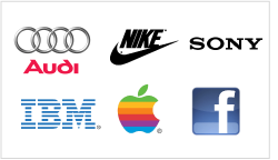
There is a big debate over the complexity of a logo. There are some obvious benefits to simple logos. They are by far the most versatile and easily identifiable. Just look at the logos of Apple, Sony, Honda, Nike, or Guci.

These logos are easy to reproduce in any size and any color, even black and white. They are easy to embroider or emboss on nearly any apparel or material. These logos are easy to make out from afar and easy to identify.
Not everything about simple logos is so great, though. It is extremely difficult to come up with a new shape and make it interesting. If you look at Nike’s logo, it is not a piece of art per say, but it is a unique shape, which makes the logo timeless and original.
From a client’s point of view paying money for a simple square or half a circle just isn’t worth it. We often hear our clients say: “Well this is not very creative” or “I could have made the same logo myself”. Indeed, simple logos (sometimes just a letter or a simple geometrical shape) just don’t look like much work has gone into them. And yet, take a look at the most famous and recognized logos out there: IBM, JVC, Google, DELL, IKEA...

Read the rest of this entry »


