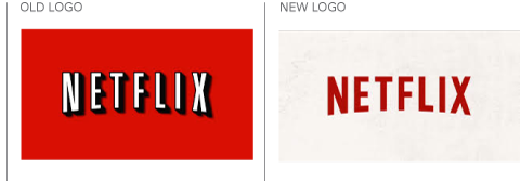
Netflix logo “refreshed”
May 16th, 2014
Movie rental subscription service Netflix has been around now for almost twenty years. A lot has changed during that time; mostly recently Netflix’s logo design.

When Netflix first started, the only way you could use it to watch movies and TV box sets was to create a wishlist of titles online, and then wait for the physical DVDs to be delivered to your door. Back then, in the late 1990s, Netflix’s logo was designed to catch the eye among the other envelopes that arrived in the mail; it was all bold, shadowed type and a bright red, black and white pallette.
These days, though mail order is still a widely-used option, many people watch their Netflix via a computer, tablet, Smart TV or another enabled device. Netflix is also branching out to provide Netflix-exclusive TV shows, so on-screen logo visibility is more of a priority.
A bright red background color no longer works.
To this end, Netflix has recently been displaying a pared back, stripped down version of its logo. Removing the drop shadow and simplifying the font, the new red on white branding also looks much better in monochrome for better on-screen visibility.
It’s a refresh, rather than a redesign, and still looks unmistakeably ‘Netflix’, but the move shows that Netflix is keeping up with the times and ensuring the continued relevance and recognisability of the brand.


