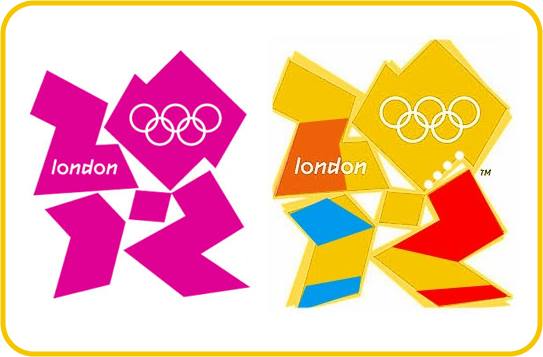
Logo Disaster - 2012 London Summer Olympics!
August 29th, 2014

The logo for the 2012 London Summer Olympics proved to be an awkward disaster when internet users started pointing out they were seeing a little more than just some abstract shapes.
The design was already being criticized for its blocky & clumsy appearance, but fuel was added to the fire when someone claimed it looked like a Swastika. The country of Iran also chimed in with threats of a boycott because they saw a close resemblance to a Zionist symbol in the design. And, last but not least, the design took a comedic turn when someone pointed out it looked like two Simpsons cartoon characters engaging in something not suitable for a discussion at work!
It is not uncommon for people to see a double meaning in a logo design. But the question is whether or not it was intentional on the part of the designer.
This can happen if a design is abstract or if the object within the logo is poorly designed, leaving its meaning an ambiguity to the person looking at it.
To avoid unwanted double meanings, you must research your design online to see if it resembles anything you don’t want it to. You must also show it to multiple people, without tell them what it is, and have THEM tell you what they see. If you get a lot of different answers then you should probably re-evaluate your design and make necessary adjustments to remove the ambiguity.


