Logo Design in NYC – Dreamers Ink Aesthetics
November 5th, 2013
Dreamers Ink Aesthetics, recently rebranded as DIA, could just be the epitome of New York City cool.
This Manhattan-based design agency, located in the trendy Little Italy district, has worked with some of the biggest names in the biz. Clients have included Google, Nissan, Nike, Nokia, Revlon, Kraft and many more recognizable brands.

The agency specializes in branding, but under this creative umbrella it not only has expertise in graphic design, logo design and typography, but also illustration, film, motion graphics and musical direction. These are some talented artists!
DIA was founded by its Creative Director, Mitchell Paone: advertising and branding expert, part time jazz-fusion musician, and fine artist. Paone has won numerous accolades for his work, including a Silver award in the Graphis Poster Annual competition, the Art Directors Club Young Guns award in 2010, and Finalist in a One Club Design contest in 2011. He has also written or contributed to some notable art-focused publications including Los Logos, Play Loud, Twenty120 and Good Magazine.
The equally talented Meg Donohue is DIA’s Managing Director who began her career on the account management side of agency life, before pursuing a graphic design qualification at The School of Visual Arts. Donohue is a skilled motion graphics producer and designer, and – according to her website biography – a renowned bell-ringer too!

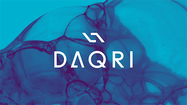
Browsing the portfolio section of the DIA website is like looking through a coffee table book of the ‘101 Coolest Designs’. I particularly love DIA’s use of slick custom typography overlaid onto hip graphics, photo- or videography. For example, this still taken from a launch campaign for Centric, a new jazz/soul TV network; the VH1 Black History Month ads; or the customized font overlaid onto a close up of handmade ink bubbles for software developers Daqri.


Another of my favorite DIA designs is the logo and branding that was created for a new wine venture, Black Jack. The striking typography is incredibly simple, yet nods to the card game of the same name without having to reach for the clichés: the red and black color palette, and the upside-down ‘Jack’ which mimics the orientation of a classic picture card.
DIA’s work can perhaps best be summed up by this gorgeous film; commissioned by car manufacturer Nissan, for their ‘Journey to Zero’ campaign. The short movie combines all of the design elements I have described above with original filmography and an original musical score. I’m not surprised that it was a finalist in a major design competition!
About the Author:
Although her primary niche is in scientific writing and editing, freelance writer Lisa Martin is also a creative type with an eye for design. She regularly works alongside graphic designers and as such has a keen interest in the development of logos and branding.


