Jump in quality for Rio Olympics Logo
January 5th, 2011

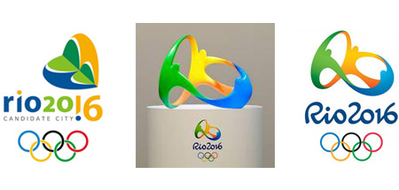
Back when it was announced that Rio de Janeiro would host the 2016 Olympic games, their candidate logo was quite frankly a bit strange. In fact, I don't quite understand what was it meant to represent. My best guess is that it's probably a weird hybrid between a heart and some kind of flower. Of course, it might also have been some kind of insect. Or two headless people hugging a reversed pine tree. Seriously, people should not be taking lessons from the London Olympics logo already discussed on this very blog. Non harmonious shapes, strange coloring and awkward positioning, Rio's candidate logo was not quite as bad as London's pile of scrap, but close up there.
Thankfully, this is not Rio de Janeiro's final Olympics logo. Described as "three figures -- orange, green and blue -- embraced at the arms and in a flowing dance", this logo may not have the most original concept ever, but it's a good, time-tested concept that works. The idea behind it is recognizable, and the smooth flow of the three multicolored figures is well representative of the collaboration between a great many diverse nations - the whole idea of the Olympic games. It also showcases Rio's cheerful spirit. In contrast to the modern, technological graphic, thecustom font adds a lively touch to the logo. It will look good on promotional merchandise, including even 3D products. According to The Huffington Post, "nearly 140 agencies participated in the initial stage of the logo design process, and eight worked in final phase."In contrast with the disastrous London Olympics logo, Rio de Janeiro's case is one of a design catastrophe successfully averted.


