Cutest Cat Logos around the Internet
January 27th, 2016
Anyone who has spent any amount of time on the Internet at all knows a deep, fundamental truth: the true purpose of the Web is not information, communication, or even porn: it’s looking at adorable kitty cats and sharing them with all your friends… and acquaintances… and people you’ve “friended” for no good reason at all… and complete strangers… basically with everyone who loves adorable kitty cats, which of course means absolutely everyone on the planet.
As an Internet company shamefully lacking in cat pictures, we at LogoBee had long been feeling left out. Something needed to be done to remedy this deplorable situation. So, after literally minutes of thorough Internet browsing, we now present to you, the absolute cutest cat…
…logos. It’s cat logos, ok? Not actual cats. We’re still a logo design company, after all. Sorry for the disappointment. They’re still pretty cute, we swear!
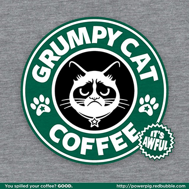
There’s already Grumpy Cat-endorsed pet food and Grumpy Cat movies, so while this doesn’t exist yet, let’s face it, it probably will sometime in the near future.
A cat logo made of tangled threads? I suppose you could call this a… cat cradle!
In an interesting visual effect, the empty space between the cat’s legs forms the vague shape of a mouse. Imagine: a cat is chasing after a mouse, but then, in a plot twist, it turns out the mouse never existed, it was nothing but a construct of the cat’s imagination all along! Beat that, M. Night Shyamalan!

In Asian culture, one usually drinks tea without sugar, but that’s okay because the kitty is so sweet!
So it’s a lot like this Friskies advertisement, but as a logo instead, so we guess you’ll just have to imagine the kickin’ banjo tune it’s playing.
“Petit Chat” means “Little Cat” in French. French makes everything sound sexy, so maybe that’s why it looks like the kitty is giving us her best bedroom eyes.
This is a logo for a pet food and goods’ shop. We figure we’d make that clear, because “the goods for having a tail” is a bit vague. It’s also blatantly false advertisement, as no matter how much we fed their food to our hamster Chubby Mc. Chubster, he never did grow a tail. Absolutely shameless.
Meanwhile, here we have a cat that looks like a chat bubble… a Chat Cat. Try saying that 10 times fast. ChatCatChatCatChatCha- dang it!
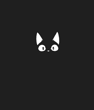
In a dark, dark town was a dark, dark street, in the dark, dark street there was a dark, dark house, in the dark, dark house there were dark, dark stairs, down the dark, dark stairs there was a dark, dark cellar, and in the dark, dark cellar lived an adorable kitten, d’aaawww!
(That or something unspeakably terrifying that uses the face of a kitten to pray upon the unwary)
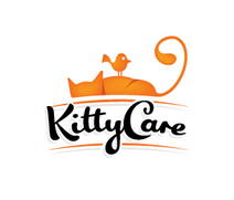
Is the message here that the bird is taking care of the kitty? We suspect that it’s the kitty who is going to “take care” of that bird as soon as it wakes up.
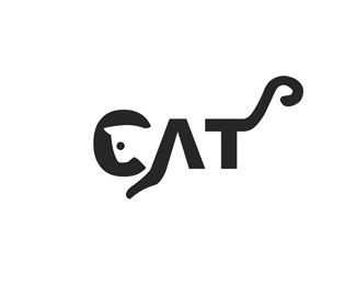
Well, this definitely proves it, cats are cuter than heavy machinery.
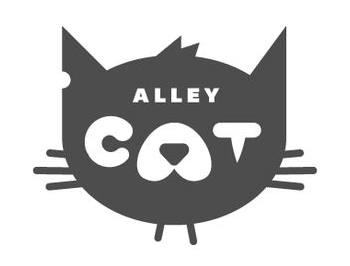
So the “C” looks almost like a black eye while the “T” forms a scar. That’s really clever, although what company would actually take a mangy alley cat for a logo, we have no idea.
Why “Hypnocat”? We don’t get it. It doesn’t even have swirly eyes or anything. It’s not even holding a pendulum. Could somebody please explain?
This thing is met somewhere on the crossroad between Cute, Bizarre and Creepy because it kinda looks like a half-cat half-snake, and there are amply enough abominations in the world without adding catsnakes to the mix.
Math and science are made significantly more entertaining with the simple addition of zombie cats!
This one is just plain adorable <3
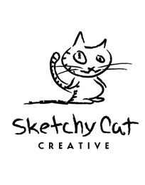
It’s a cat! No, it’s a sketch! It’s… SketchyCat! Can’t leap tall buildings in a single bound, but can… have an eye ridiculously out of proportion compared to the other! That’s sure to send evildoers scrambling.
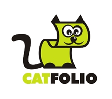
Speaks for itself. There’s really not much that can be said about this except “what… the…”
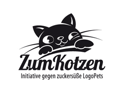
The utter adorableness of the cutie kitten is somewhat offset by the fact that a quick Google search reveals that the word “kotzen” means “to throw up” in German, with “du bist zum kotzen” translating to “you make me sick”. No, we have no idea what’s up with that, but now you won’t be able to look at this logo without imagining the kitten barfing all over the place.
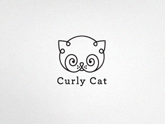
Maybe this should have been Hypnocat instead. Though, those could also be magnificent whiskers which would make any moustache-twirling train-tracks-tying silent film villain go green with envy, but then that begs the question, where are the eyes?
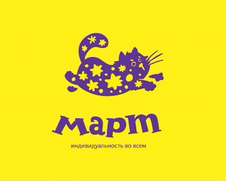
And here we witness “Mart”, a tragic victim of crossfire in the Great Paintball Battle of 2014, Lord rest his poor yellow paint-splattered soul.
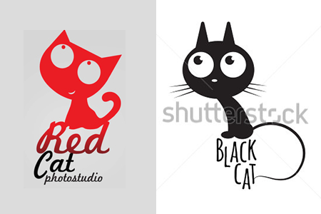
And here are Red Cat and his friend Black Cat, reacting to poor Mart’s misfortune. Black Cat is fittingly sympathetic, while Red Cat seems to be smiling... There’s nothing to be smiling about, Red Cat! Too many innocent civilians have unjustly been painted in those inhumane clashes! This is serious business!

We get what they were going for, but now it looks like a featureless white face with a black hole in the middle of it. That’s actually kind of creepy. Why is it even on this list..?
My cat is also a fork. Your argument is invalid.
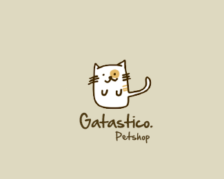
The name of this pet shop literally translates to “Catastic”. Which is exactly what this logo is. Absolutely catastic!
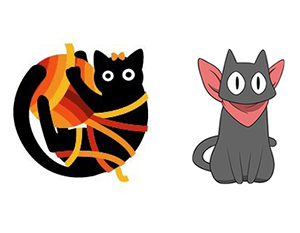
We’re not the only ones seeing a resemblance here, right? Right? (The second cat is Sakamoto from Nichijou).
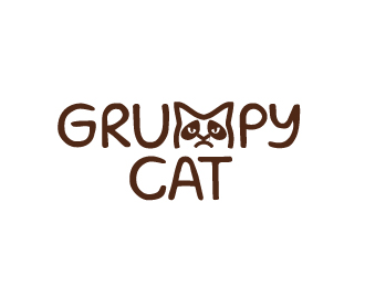
And so, the cycle begins anew...
About the Author:
Daniil Stoenko is a professional writer and translator who produced a variety of articles for LogoBee’s Logo Design Blog over the years.
