Cooler and Controversial logo design
April 5th, 2016
Does Rhode Island’s new logo, created by acclaimed designer Milton Glaser, really pale before this replacement created by local designer in 10 minutes?

New Rhode Island logo created by Milton Glaser
Rhode Island is currently conducting a marketing campaign with the goal of raising awareness about the state as a tourist destination. Or trying to conduct one, anyways, apparently with little success: on Tuesday, the state was forced to pull a promotional video from Youtube after it came to light that some of the scenes were not shot in Rhode Island at all, but in Reykjavic, Island. And now, the program’s logo, created by the mind behind “I <3 NY” Milton Glaser, is being overshadowed by an unofficial replacement created by Rhode Island designer Missy Hardesty.
Does lightning strike twice? “I <3 NY” is an undeniable masterpiece, but Glaser’s latest logo – meant to represent a white sail, the warm sun and the sea – has on the contrary been subjected to harsh criticism. Many Rhode Island residents resent the decision to outsource the work to a designer outside of the state, and the logo itself has been called “cheap, dated and unsophisticated” by local designers. Most of all, the insipid catchphrase “Cooler & Warmer” seems to be utterly reviled by just about everyone, though Glaser cannot be blamed for that that particular slipup.

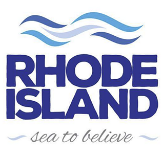
Logo created by Missy Hardesty
Missy Hardesty, who states that the new logo “hurt her eyeballs”, took it upon herself to come up with a replacement. Created in just 10 minutes, her logo represents stylized ocean waves. She also came up with the play on words “Sea to Believe”, which certainly sounds better than “Cooler & Warmer”, even though (as she herself admits) Rhodes Island is technically located by the ocean, not the sea.
The logo has achieved explosive popularity among the state’s residents, with over 17,000 Facebook shares in less than 24 hours and even a T-shirt available on Teespring. According to a poll held by Newport Buzz, 80% of almost 15,000 voters prefer Missy’s design and catchphrase, 18% would rather keep the state’s current logo and slogan (Discover Beautiful Rhode Island), and only 2% are fond of the new official logo.

Old Rhode Island logo
Despite this, the state does not seem keen so far on swapping Glaser’s creation for Hardesty’s logo. Perhaps this is for the better in the long run: the abstract sail shape is certainly more artistic and daring than the more conservative design of the would-be replacement. Still, it seems that the outcry did not completely fall upon deaf ears, as the catchphrase “Cooler & Warmer” was eventually outright removed from the campaign. And to that, we say “good riddance”.
About the Author:
Daniil Stoenko is a professional writer and translator who produced a variety of articles for LogoBee’s Logo Design Blog over the years.


