Clinton logo design causes a Twitter storm
April 15th, 2015
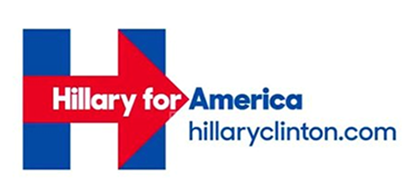
Former First Lady Hillary Clinton announced that she would be running for the US Presidency again this year – and of course, every good marketing campaign needs a logo. Here’s Hillary’s:

The logo makes effective use of the traditional red, white and blue color scheme symbolizing America. It’s clear, bold, possible to reproduce in monochrome without losing detail, and succinctly converys the key message of the Clinton campaign.
Not everyone has been so positive about it, though! As soon as the logo was launched, the good people of Twitter took to the social media platform to air their views.
Many complainants have been quick to judge the logo’s simplicity, saying that it looks like it was made in MS Paint, or by a third-grade school child. Others have pointed out some similarities with other well known logos and symbols…

Hillary for Hospital?

Hillary for Cuba?

Hillary for FedEx?
Though quite possibly tongue-in-cheek, given its disdain for intellectual property, Julian Assange’s secret documents website also publicly accused Mrs Clinton of stealing the WikiLeaks logo:

Hillary for WikiLeaks?
What do you think about Hillary Clinton’s campaign logo? Is the right-facing arrow symbolic of progression and hope in the future, or a political shift to the right for the left-leaning Democrats?
About the Author:
Although her primary niche is in scientific writing and editing, freelance writer Lisa Martin is also a creative type with an eye for design. She regularly works alongside graphic designers and as such has a keen interest in the development of logos and branding.


