Home

Microsoft replaces Nokia Lumia logo

October 31st, 2014

In the late 90s and early 00s, Nokia was the ‘must-have’ mobile phone brand – who didn’t have a Nokia 3310? But, failing to keep pace with the rapidly evolving smartphone market, the cellphone arm of the Finnish comms company suffered and was sold to US tech giant Microsoft in 2014.


Though the Nokia logo has so far co-existed alongside Microsoft Mobile, the end is now nigh for Nokia-branded phones. Its flagship smartphone – originally branded as the Nokia Lumia Windows Smartphone, is now dropping the untrendy Nokia tag altogether.

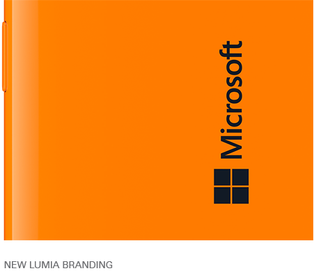
Here’s the new Lumia branding: very definitely a Microsoft phone now, featuring the signature Microsoft flag. Interestingly, the brand name Lumia has also disappeared from the phone!

Read the rest of this entry »

Aerial Bold: turning topography into typography

October 30th, 2014

The brains behind an innovative new idea fusing typography with geography and computer science are seeking financial backing via crowdfunding platform Kickstarter.

German computer programmer Benedikt Groß and American geography student Joey Lee have teamed up to create the world’s first font from real Google Earth satellite images.

Read the rest of this entry »

Responsible advertising: should certain brands be banned from children?

October 22nd, 2014


Advertising in the world of sport is big business. Not only are there advertisements on and around the pitch or court, but almost every single athlete or sports personality also wears at least one sponsored brand on their clothing.

In British football (soccer), every team has a big corporate sponsor, ranging from telecommunications companies to financial institutions to airlines to high street brands. In short, almost any company that has enough cash to pay for the publicity can bid to feature on the front of a team’s kit.

Read the rest of this entry »

What is your take on fakes? Is Moschino logo belt the most faked accessory?

October 17th, 2014

They say imitation is the sincerest form of flattery, but counterfeit goods cost the design industry billions of dollars each year.

When it comes to fakes and the real deal, sometimes the difference is very obvious. I remember holidaying in Greece when I was younger and seeing laughing at the misspelled brand names for sale in the local market - “Adibas”, “Pansoanic” and “Reebock” spring to mind. Why buys these things?!

Sometimes the difference is not in the spelling but the quality. Famous prints like Burberry tartan or the Louis Vuitton logo are seen not just on genuine designer bags and clothing in high end stores, but also on copycat goods made from plasticky, cheap materials sold on market stalls and in low-end wholesalers. 

I recently read an article in the newspaper which asked the question, “Is Moschino’s logo belt [below] the most faked accessory?”


Read the rest of this entry »

Daredevil logo design, and more from Marvel Comics

October 16th, 2014

Superheroes are so hot right now.

Over the last few years, it seems as though a new big screen adaptation of a Marvel comic book favourite has been released every other week. As well as the Spiderman and Superman remakes, recent cinematic highlights have included Iron man 3, Captain America: The Winter Soldier and Guardians of the Galaxy. Further comic book releases are due to hit our screens in 2015.

But it’s not just the big screen that is enjoying Marvel-lous success. Off the back of the success of TV boxset series such as Breaking Bad, Homeland and The Wire, we are now entering a new era of serial comic book adaptations for the small screen. Gotham, a Batman spin-off charting the rise of Commissioner Gordon before Batman’s arrival in the city is due to hit screen very soon, and press coverage has started to ramp up for the launch of another superhero TV series in 2015: Daredevil.

Read the rest of this entry »

New templates added!

September 26th, 2014


New templates, including some freebies, have been added. Come check it out! :)


Read the rest of this entry »

Web Design Portfolio Updated!

September 9th, 2014

We invite you to come see some new and attractive samples in our newly updated web design portfolio!

Read the rest of this entry »

Madonna's Logo Drama

August 29th, 2014


In 2012 Madonna launched her Truth or Dare fragrance. The logo for the perfume consisted of the letter M combined with a cross symbol. The logo made perfect sense considering it was made using the letter M and a religious cross – a symbol Madonna has often used throughout her career in her music videos and photographs.
Read the rest of this entry »

New logo templates!

August 29th, 2014


Our logo template gallery has been updated once more with some great new designs, as well as some free vector downloads, ready for the taking!

Read the rest of this entry »

Logo Disaster - 2012 London Summer Olympics!

August 29th, 2014


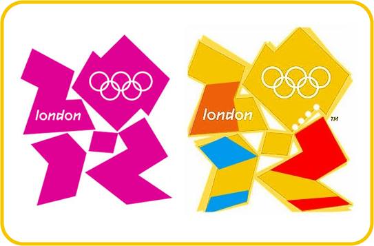
The logo for the 2012 London Summer Olympics proved to be an awkward disaster when internet users started pointing out they were seeing a little more than just some abstract shapes.

Read the rest of this entry »

Business Card Design Guidelines

August 12th, 2014

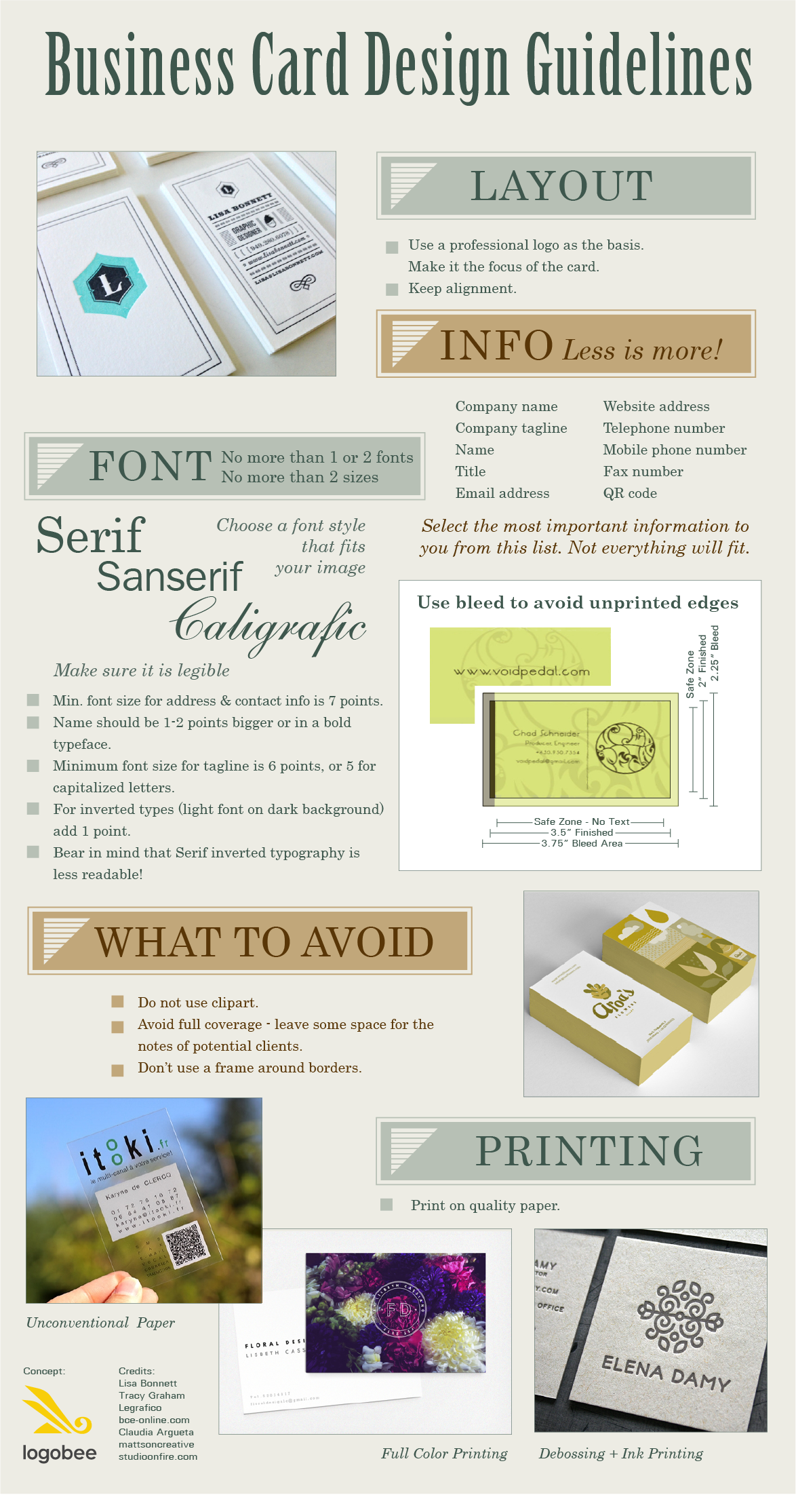
When you are handing out a business card, you are introducing someone to your company for the first time. It is therefore important to make a good first impression with an attractive logo design, as well as a well-designed business card that projects quality, professionalism and a dash of pizzazz to set yourself apart from the crowd.

LogoBee logo design has come up with some guidelines to consider when having a card designed. Having a good logo design is a great start but it is equally important for your card to do your logo and your business justice.


Read the rest of this entry »

Pepsi's Logo Mishap

August 8th, 2014

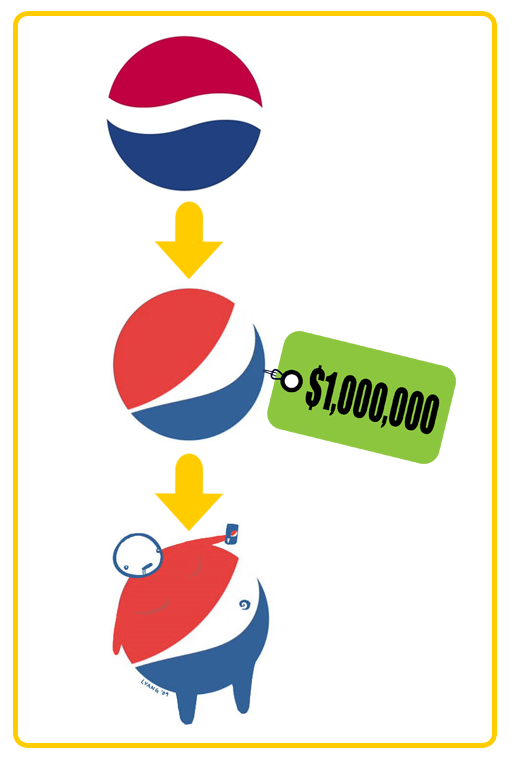
In 2009, Pepsi spent a rumored one million dollars to revamp their logo design. The company was ridiculed in the mainstream media for the exuberant amount of money it spent and insult was added to injury when graphic design artist Lawrence Yang further ridiculed the design by creating a sketch of an obese “Pepsi Man,” highlighting the negative health effects of sugary soft drinks.

Read the rest of this entry »

Brazilian World Cup logo design sends mixed messages

July 14th, 2014

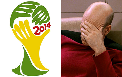
For a dedicated football (soccer) fan, seeing your country win the coveted Jules Rimet trophy is literally The Best Thing Ever. Though my team, England, crashed out of the 2014 FIFA World Cup in the early stages, the excitement and passion of “the beautiful game” continues and many are eagerly awaiting Sunday’s final battle between Argentina and Germany.

Read the rest of this entry »

Sports field logo design

June 17th, 2014

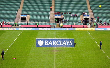
Once upon a time, sports fields were green. Sometimes with subtle stripes mown into the lawn, and white painted boundary lines approproate to the sport, but in general, pitches were green as grass.

But advertising at sporting fixtures has become such big business that companies must now be increasingly innovative with their product placement.

Read the rest of this entry »

Un-united Kingdom?

June 5th, 2014

Here in Great Britain we’re all eagerly awaiting the Commonwealth Games.

Whereas at the Olympic Games British athletes compete for Great Britain & Northern Ireland, at the Commonwealth Games we can support English, Welsh, Scottish and Northern Irish athletes individually, as well as competitors from the smaller constituents including the Channel Islands, and the Isle of Man.


Read the rest of this entry »