Home

Playboy Bunny makes more money

October 16th, 2015

Don’t worry, this article is safe for work!

To the surprise of many, it was recently revealed that men’s ‘entertainment’ magazine Playboy is going ‘non nude’. Starting with the March 2016 issue, Playboy will no longer feature naked women in its magazines or website.

The reason? According to a Playboy chief executive, nudity is “just passé” these days. ‘Proper’ porn is so widely available on the internet it seems there is just no need for the ‘lite’ brand of titillation Playboy offers. Furthermore, it’s incompatible with today’s social media-hungry consumers: because nudity is banned on Facebook, Twitter and Instagram, Playboy can’t avail itself of the clicks and likes that other magazines thrive on for publicity.

Read the rest of this entry »

Hells Angels vs the Hipsters

October 15th, 2015

Legal disputes over logo usage are fairly commonplace – but what do you do when the company suing you for breach of trademark is a criminal organization?

Reports in the Australian media this week told of an impending court case brought against a “hipster” fashion retailer by an Australian chapter of legendary biker gang The Hells Angels.


Read the rest of this entry »

For DFW, orange is the new blue

October 7th, 2015

This week, Dallas Fort Worth airport launched a new logo – the first major redesign of its branding for 14 years.

DFW has grown from a small domestic airport to an international travel hub with millions of passengers passing through each year – the ninth busiest airport in the world. “We needed to evolve our brand to be more modern, memorable, unique and – critically – global,” said airport chief executive Sean Donohue, during the launch event.


Read the rest of this entry »

Best Western gets a new name and seven new logos

October 1st, 2015

In an effort to keep up with the changing and varied needs of travelers, Best Western is the latest hotel chain to undergo a facelift.

No longer to be known as Best Western International, the chain will now be called ‘Best Western Hotels & Resorts’, reflecting the variety of property types on offer around the world – and some new ones.

The old Best Western logo

Read the rest of this entry »

The 14 crucial questions designers should ask a client before creating a logo

September 24th, 2015

Any custom logo design company worth its salt will tell you that the key to creating a successful logo is good communication with the customer. In order to provide the client with a variety of logos to choose from, it is very important for a designer to understand said client’s preferences. The only way to accomplish this is to ask the right questions, such as…

1.       What is the name of your company? This one is obvious enough. Often, the name of the company will play a major role in deciding what will be represented on the logo – sometimes, the name itself is the logo. Even if that is not the case, the name of the company is incorporated into the logo more often than not. Even the simple question of whether the company’s name is long or short plays a major role in deciding the type of logo to be created.

2.       Which words in the company name do you want to emphasize? If the company name consists of multiple words, the client may not wish to give equal billing to all of them, especially since that might make an unnecessarily bloated logo. Some words will be made to stand out while others will be given minimal priority.

Read the rest of this entry »

Verizon new logo design: simple yet effective, or too simple and ineffective?

September 16th, 2015

Though the news was somewhat overshadowed by Google’s new logo launch this week, another big corporation has decided to go for a rebrand.

To mark its $4.4 billion acquisition by AOL, Verizon recently engaged design consultancy Pentegram to come up with a new logo for the telecommunications giant.


Read the rest of this entry »

New holding company, new logo design for Google

September 9th, 2015

I recently wrote about Alphabet, the new holding company that now owns Google and some of its subsidiaries. With this major change in structure, you could have predicted that Google itself would soon undergo a rebrand.

It happened.

As I opened up my internet browser on Monday, I noticed that the Google logo on my search engine home page looked a little different. At first I assumed it was a Doodle, another creative play on the original design to commemorate some significant event or another. I soon realized however, this is Google’s new look.


Read the rest of this entry »
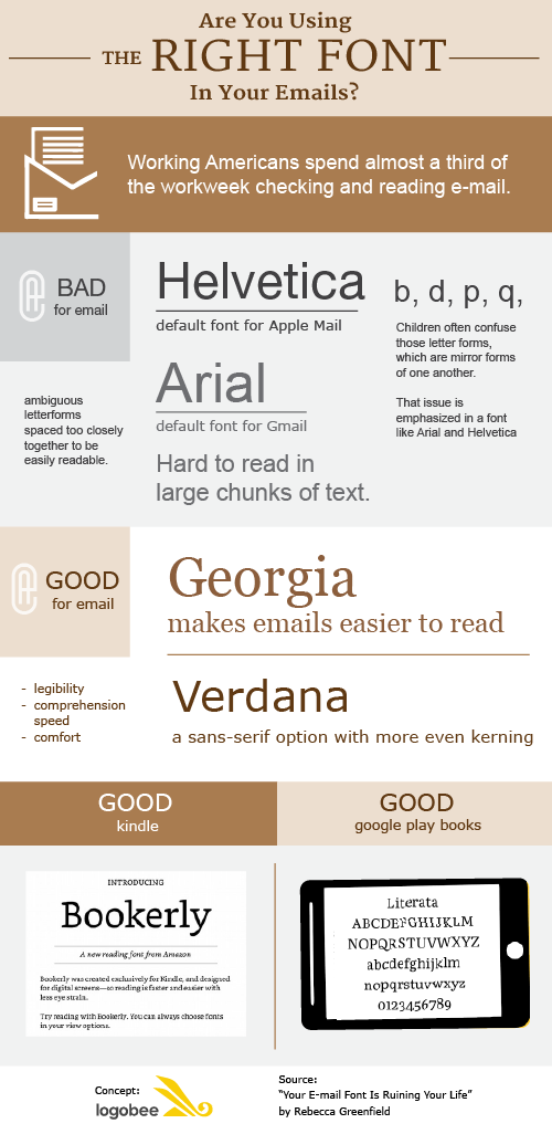
Why you should change the font you use for emails

August 27th, 2015


Read the rest of this entry »
Google, but all grown up

August 21st, 2015

The big news in the business world this month was that Google has a new owner: a holding company called Alphabet. What does this mean for the world’s favourite search engine?

Well, not much really.

Users of the company’s services won't notice any difference at all. Alphabet, which is owned by Google’s founders Larry Page and Sergey Brin, is simply a chance to reorganize assets and mitigate risk on the stock market.

Read the rest of this entry »

New logo design for a new, more serious Mini

August 18th, 2015

In my mind, the Mini has always been a fun car – quirky, full of personality and always iconic. Think The Italian Job, Austin Powers’ “GR8 SHAG” model, and even Mr Bean’s classic beige number.


Read the rest of this entry »

Logitechs squeaky clean new logo design look

August 14th, 2015

Though perhaps not a brand you’d immediately recognize on The Logo Quiz, Logitech is a computer peripherals company that has been around for over 35 years. Sat quietly sat in the backseat of its glitzier competitors, Logitech has been churning out useful, if not scintillatingly exciting devices since 1981.

Their products may not be as sexy as an Apple Watch – well, as sexy as an Apple anything, really – but that didn’t matter because everyone needs a mouse. In fact, if it hadn’t been for Logitech, we might all still be using the cursor keys to move around our screens.


Read the rest of this entry »

Goose beers brands

August 10th, 2015

In my last blog post I wrote about some of the beers made by an award-winning craft beer brewery near my home town, the Purity Brewing Co. One of their products, the intriguingly titled ‘Mad Goose’ pale ale, is named after a rather viscious bird found wandering the farm-based brewery grounds!

As I did some research about this brand, I came across several other ‘goose’ branded beers from around the world. Just for fun, here are some of these bird-themed brands!

Read the rest of this entry »

Parallelism or plagiarism of logo design?

August 5th, 2015

The issue of plagiarism in logo design is one we frequently denounce. But could it be that sometimes the public may be slightly too hasty in accusing a logo creator of plagiarism?

Read the rest of this entry »

Purity Brewing Co Beer logos with a back story

August 3rd, 2015

In the UK room temperature “real ale” has been the drink of choice for bearded old men for centuries. However, in light of the huge craft beer revolution across the pond, it’s now bearded younger men (and women, though less bearded) – of the hipster variety – who can’t get enough of the chilled versions of this traditional beer.

Read the rest of this entry »

Why do colors look different between monitor and print?

July 29th, 2015


Let’s start by analyzing our computer setup. First of all, there are different monitor brands and different video processors. Each comes with its own abilities to reproduce colors and brightness, determined by its hardware. Additionally, there exist all sorts of software setups, such as the monitor’s color mode, the color calibration of your computer and the video card software. This is why colors may look different from one monitor to another.


Read the rest of this entry »