Home

3000+ free editable logo design templates from LogoBee

October 9th, 2018


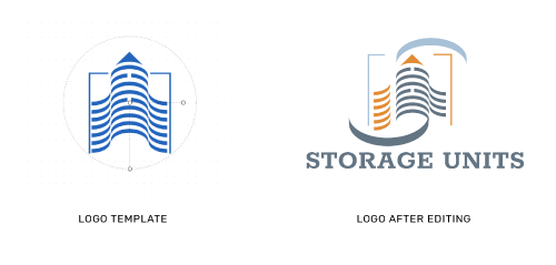
LogoBee is proud to release its brand new Logo Design Maker tool. While custom logo design has always been and remains our focus, an oft-overlooked aspect of our business is our selection of pre-made logo templates, perfect for the startup company on a tight budget. Our entire impressive collection of approximately 3000 logos has been made available to download free of charge including logo files for all major social media sites. SVG Vector files for the printing use are available for only $39. This collection contains logos fit for corporations, hi-tech companies, medical suppliers, law firms, environmental companies and phone apps – among others – and is continuously being expanded, ever widening the possibilities available to our clients.


Read the rest of this entry »

A new logo design half-price promotion for every company from A to Z

October 2nd, 2018


Since the year 2000, LogoBee has been one of the top providers of custom logos created by in-house designers. Right now, for a limited time, LogoBee is launching what may be the biggest promotion in its 18-year existence.

Until the promotion ends, every day will be dedicated to a specific letter that will be displayed on LogoBee’s Promotions page: https://www.logobee.com/logo-design-promotion.php. Any company ordering a custom logo design package on that day is entitled to receive a whopping 50% discount on LogoBee’s services, provided its name starts with the letter displayed that day. Letters will change daily at midnight, cycling through the entire alphabet in order, making it easy for any company to take full advantage of this offer – just check the page regularly and don’t miss the day your letter appears!


Yes, you read that right – 50% off on any custom logo design package created in-house by our professional logo designers. With this deal, every day, someone’s a winner!


Read the rest of this entry »

Checkmating: 2018 World Chess Championships logo evokes a sexual position

January 9th, 2018

What comes to mind when you think of chess? Quiet intensity, tactics and combinations, predicting the opponent’s next move, the ultimate battle of wits? If you said “steaming hot sex”, either you have a very interesting fetish or you are the designer of the logo for the 2018 World Chess Championships in London. Maybe both.

Read the rest of this entry »

26 best cursive Google fonts for logo design

November 1st, 2017

From logos to business cards, websites to brochures, a font can make or break a medium. The right font can draw attention to your material and make it pleasant to read. But where can you find cool and unique fonts without having to pay extra for them?

Google’s font collection is an amazing resource for beginner designers and pros alike. With 846 fonts in more than 135 languages currently available and more to come, you are certain to find a font for any occasion. Every font in the collection is completely free to download, so even low-budget projects need not compromise on font quality.

We at LogoBee have decided to compile 26 of the most beautiful cursive and brush Google fonts for you, from very formal and elegant script fonts such as Monsieyr La Doulaise and Roundhands to cool vintage fonts such as Lobster and Pacifico. Enjoy the primal, earthen beauty of Rock Salt, the fine, ethereal charm of Euphoria, and many other fonts that will help you add a personal touch to your projects.


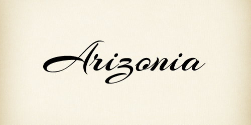
1. Arizonia font

https://fonts.google.com/specimen/Arizonia


Read the rest of this entry »

5 pitfalls of using templates for web design

September 28th, 2017


In today’s business environment dominated by the slogan “better, faster, cheaper”, templates are often seen as the go-to solution for everything. Need a logo? Get a free template. Need a website created? There are template-based web development platforms for that as well. Many entrepreneurs tend to think of these platforms as being “basically web design, but simpler and cheaper.” Unfortunately, it doesn’t quite work that way: if you don't choose a website building platform wisely, there are several drawbacks to web template platforms that custom web design does not share.

1.       You don’t own your website. This is the root cause of many issues with website templates. The development platform hosts your website, essentially “loaning” it to you. In fact, if you read the Terms of Use of some template-based web development platforms, you will find that they can freely modify your website without your consent.

2.       Website templates are cheaper… in the short run. A corollary of the above, really. As tempting as it may seem to save on web design, you need to consider that template-based web development platforms usually run on a “freemium” basis. To remove ads, change your domain name and overall give your site a modicum of professional appearance, you need to pay a monthly subscription fee, and the more functionality your website has, the higher it rises. You might save money in the short term, but in the long run, even a dozen dollars a month can gradually add up.

3.       You have very limited options for modifying your website. Your company may grow, but web development platform templates offer very limited possibilities for expansion compared to a site you own. Eventually, your company may “outgrow” your website, and then you will have to buy a custom website anyways and go through the trouble of migrating all your data, something that’s not always easy depending on the platform you use.

4.       Your website may look generic. Templates are not exactly known for giving much room to creativity. Even with a variety of design options available, your site will typically lack a “personal touch” to make it really stand out. Experienced web designers can help you find a way to personalize your website, so without professional assistance and with relatively limited template material to work with, your site may come off as dry and impersonal.

5.       Template-based websites are not always the best for SEO. Despite many companies’ claims to the contrary, it is frequently difficult to implement a working SEO strategy into template websites, leading them to be ignored by Google searches.

Unless you are a trained automobile mechanic, you probably wouldn’t build your own car. Shouldn’t the same logic apply to a professional website? Missing or malfunctioning features and poorly implemented SEO can cost you hundreds of thousands of dollars in lost revenue. Template-based web development platforms may be fine for blogging and other limited applications, but if your business goal is to go big, it may be a good idea to invest into a professionally-designed website that you can grow and expand in accordance with your clients’ and your company’s needs.


About the Author:

Daniil Stoenko is a professional writer and translator who produced a variety of articles for LogoBee’s Logo Design Blog over the years.

Read the rest of this entry »
When sports logo design goes wrong

July 12th, 2017


The importance of any logo is impossible to overstate, but sports teams’ logos are in a league of their own. Just think of all the places they appear: the players’ uniforms, memorabilia sold to fans, the team’s home stadium, live on air during televised matches, and so on. A company getting a bad logo is always an unfortunate event at the very least, but a sports team getting a bad logo is nothing short of a catastrophe. This does not stop teams from occasionally ending up with some real stinkers.

Read the rest of this entry »

Logo plagiarism: the devil is in the details

March 29th, 2017

Logo design plagiarism controversies are one of the most common topics our blog deals with. However, even as we defend some designers and accuse others, you may have noticed that we have never approached things from a purely legal perspective. Why?

Read the rest of this entry »

How simple is too simple in logo design

January 26th, 2017

If you are a fan of tennis, you are probably following the Australian Open, and if so, you may have noticed that just about everyone, aside from Federer, seems to be wearing the same Nike outfit for whatever reason, right down to the sneakers! Not exactly convenient for telling one athlete from the other. How funny that the logo for the tournament should suffer from the exact same issue as well?


The updated logo of the Australian Open has made very few fans so far. According to a poll conducted by The Huffington Post Australia, 66 percent of respondents prefer the old logo over the new one. The overwhelming opinion is that the replacement simply fails to convey the essence of the tournament as well as the old logo – depicting a tennis player in the glare of the scorching Australian sun – did.

Read the rest of this entry »
Freudian slip-ups: the most sexually suggestive logos

December 20th, 2016

If father of psychoanalysis Sigmund Freud is to be believed, the human mind revolves mostly around sex. Looking at some of the logos on today’s list, it’s easy to see where he was coming from – no pun intended. None of them have been created for companies that deal in sexually explicit goods and services, yet they look like they might as well have been. Whether their designers’ sexual urges and frustrations drove them to subconsciously draw genitalia or whether the viewers’ perverted minds caused the misinterpretation of completely innocent designs matters little – one way or another, one they still prove Freud was right.


A word of warning: this article does contain some suggestive imagery and potentially inadequate language, and may be considered mildly NSFW depending on the standards of your workplace.


Read the rest of this entry »
FIFA 2018 World Cup mascot: The secret dark side of Zabivaka

October 26th, 2016


Out of the three prospective official mascot designs for the upcoming 2018 FIFA football World Cup in Russia, Zabivaka the wolf was chosen by a landslide, easily beating the competition – a tiger and a cat. He is a charismatic character, whose official biography describes him as “charming, confident and social”, and as “a fair player, [who] values his team members and respects his opponents”. Yet, unbeknownst to most translators, his name tells a different story…

Read the rest of this entry »
Meetup's new logo: Beyond the nametag

October 5th, 2016


Read the rest of this entry »

Critique of the 2020 Tokyo Olympics' new logo design

August 26th, 2016

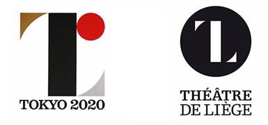
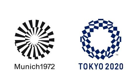
You may remember the story of the logo designed by Kenjiro Sano for the 2020 Olympics. The designer was accused of plagiarism by the Théâtre de Liège in Belgium. Sano denied the allegations, and I for one believe that the similarity of the two logos was coincidental, as the basic elements they use can be found in abundance in many types of art.

I would now like to bring your attention to the new, officially approved logo for the 2020 Tokyo Olympics. I feel like this concept is a little too similar to the logo of the 1972 Munich Olympics. In any case, though some people might prefer the new logo, in my opinion, the initial concept had more originality going for it. It looked unique in its own way and had more thought put into it.


Read the rest of this entry »
Free Illustrator Brushes - Summer Collection

August 10th, 2016


The follow-up to our summer-themed frames is finally here! This time, we have a set of brushes for you to use at your convenience! They are more flexible than fixed frames, so you can do so much more with them!

You can easily reshape your frame…

Read the rest of this entry »
6 free summer-themed frames

July 13th, 2016


Summer is in full swing! To celebrate the warm season, we have prepared a special treat for you: a set of six summer-themed frames available to download and to use for free.

With imagery such as seashells, sea stars and flowers, these bright and colorful frames can be easily integrated into your logo project or graphic design work, and are bound to evoke the idea of a happy summer vacation.


Please click here to download

Read the rest of this entry »

Netflix's New Logo: Double Trouble?

June 28th, 2016


Seems like the lion’s share of the articles in our blog consists of a) companies replacing their iconic logos by more app -friendly ones (usually to the great displeasure of the public) and b) logo design plagiarism controversies. So today, as a special treat, we’re covering a case that merges both! Except the logo is not actually being replaced. And there’s not really a plagiarism controversy. Don’t worry, it will all become clear in a moment.

Read the rest of this entry »