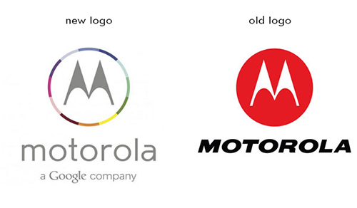
This logo has been confirmed to be Motorola Mobility's new logo design
July 1st, 2013

Ever since Google bought the company for $12.5 billion, Motorola Mobility has gone though many ups and downs. Although, the most recent development is the most noticeable and is getting people talking.
It was confirmed that Motorola is leaving behind the simple red circle for something with more color variety. As you may notice from the image, the new logo boasts a multicolored circle with Motorola's signature M inside. I guess the company's web department is a little late, because the new design isn’t on its website yet. The font was altered as well. It used to be all capital letters and italicized. Now, it’s lowercase and using thinner lines. In addition, the logo now bears a tagline: “a Google company”. It must have been Google’s idea to add it in order to show who’s in charge now.
Posted in: Branding & Marketing, Branding Tutorials, Design, Logo Design, Marketing Tutorials, News,


