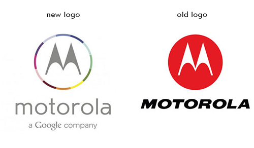
This logo has been confirmed to be Motorola Mobility's new logo design
July 1st, 2013

Ever since Google bought the company for $12.5 billion, Motorola Mobility has gone though many ups and downs. Although, the most recent development is the most noticeable and is getting people talking.
It was confirmed that Motorola is leaving behind the simple red circle for something with more color variety. As you may notice from the image, the new logo boasts a multicolored circle with Motorola's signature M inside. I guess the company's web department is a little late, because the new design isn’t on its website yet. The font was altered as well. It used to be all capital letters and italicized. Now, it’s lowercase and using thinner lines. In addition, the logo now bears a tagline: “a Google company”. It must have been Google’s idea to add it in order to show who’s in charge now.
According to VentureBeat, the logo will exist in multiple color schemes. This logo makeover was a good move, especially since the company is now owned by Google. The softer look is certainly more web-friendly, due to its colors.
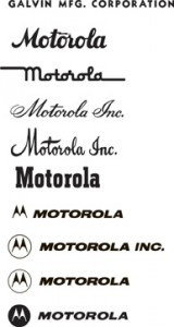
The name “Motorola” was created by company founder Paul V. Galvin in the early 1930s for the car radio—linking “motor” (for motorcar) with “ola” (a suffix used for audio equipment). While the brand name “Motorola” was established in 1930, it wasn’t until 1947 that the name was taken for the company. During the time "Motorola" was used as a brand name, the style leaned toward a handwritten, cursive look. However, when the company took the name officially, the style was changed dramatically to bold block lettering.

The name “Motorola” was created by company founder Paul V. Galvin in the early 1930s for the car radio—linking “motor” (for motorcar) with “ola” (a suffix used for audio equipment). While the brand name “Motorola” was established in 1930, it wasn’t until 1947 that the name was taken for the company. During the time "Motorola" was used as a brand name, the style leaned toward a handwritten, cursive look. However, when the company took the name officially, the style was changed dramatically to bold block lettering.
The logo kept this style until 1955, when Morton Goldsholl, an award-winning Chicago graphic designer, suggested establishing a visually strong graphic mark. “It should capture the eye of all observers–consumer, dealer, salesman, casual onlooker, or the most prejudiced company employee… [and] it should have the visual strength to last,” said Goldsholl.
That is how the “M” logo was born. It features two triangular shapes curving into a letter “M,” a sign that became known as the "batwings". During the 1960s, the “M” symbol often was enhanced with a ring. It was officially modified to include the ring in 1967. In October 2001, the logo was changed from an “M” within a ring to an “M” on a solid circle, giving it a stronger appearance that would persist for decades…until Google decided to spice things up.
Other Sources:
http://www.motorola.com/blog/2011/10/12/how-motorola-got-its-wings-batwings-that-is/


