Home> Branding & Marketing

Selecting the concept

June 20th, 2011

Now the most important part is to get the concept for a logo. It is almost the same process as selecting the name. First you have to determine what your logo should say about your company. There are many different ways to represent a company.

•You may come up with an image related to a business like a house for a real estate company, or a car for a car dealership

•You could use just an abstract image representing the company`s philosophy. For example some kind of blocky image would suit a stable trustful company or even just a pyramid. A very dynamic image with orbits and swooshes, sparks, particles could be used for a very modern, young, high-tech company to represent electrical activities or just cutting edge meteoritic technology.

Read the rest of this entry »

What is a logo?

June 19th, 2011

A Logo is a design symbolizing ones organization. It is a design that is used by an organization for its letterhead, advertising material, and signs as an emblem by which the organization can easily be recognized, also called logotype. Logotype is a graphic representation or symbol of a company name, trademark, abbreviation, etc., often uniquely designed for ready recognition.

You may also think of a Logo as a simple visual mark to identify your company product or service. There are different types of signs and emblems easily recognized and associated with purposes. For example, crests are used to identify a country or family. There was a time when only big enough organizations could afford to make their own crest. They were in some cases very detailed drawing with many objects to enrich the crest. Cost was not an issue and more was considered better. Then flags were used due to their larger format. They were visible from the craft fields from long distances. Road signs were designed for informational purposes. They use such techniques as contrasting colors, simplified and yet stylish formats to identify and attract more attention and convey information.

Read the rest of this entry »

Is it logo evolution?

January 15th, 2011

All things in life change. Technology evolves. The same can be said about human mentality. Therefore it is really not surprising that art, and of course design, is undergoing constant changes.
The nowadays worldwide, famous organisation YMCA (Young Men’s Christian Organization) is a prime example of this rule, having gone through many logos over the course of its existence.
Read the rest of this entry »

Jump in quality for Rio Olympics Logo

January 5th, 2011


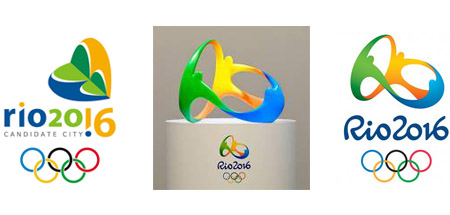
Rio Olympics logo designs
Back when it was announced that Rio de Janeiro would host the 2016 Olympic games, their candidate logo was quite frankly a bit strange. In fact, I don't quite understand what was it meant to represent. My best guess is that it's probably a weird hybrid between a heart and some kind of flower. Of course, it might also have been some kind of insect. Or two headless people hugging a reversed pine tree. Seriously, people should not be taking lessons from the London Olympics logo already discussed on this very blog. Non harmonious shapes, strange coloring and awkward positioning, Rio's candidate logo was not quite as bad as London's pile of scrap, but close up there.

Read the rest of this entry »

Mind the Gap

October 12th, 2010

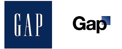
Gap logo designs


It’s always a risky move for any corporation to change its logo, and when internationally known clothing retailer Gap tried it recently, they soon learned that the customer is always right!

With industry experts suggesting that Gap was feeling out of touch with its client base in these times of economic crisis, a Gap spokesperson said that “after 20 years, it was time for change”. It was out with capital letters and a serif typeface, and in with Helvetica logotype and a blue gradient box design element – to the outcry of graphic designers and members of the public all over the world. 

Read the rest of this entry »

Double Outsourcing - A Double-Edged Sword?

June 13th, 2010

Disruptive Business Models and Negative Incentives

Outsourcing has become a growing trend in a variety of industries. As firms become more specialized in the products and services they offer, the need to outsource certain tasks has become apparent. A small business will probably find it more cost effective to hire a tax accountant than do it themselves. They also will probably want to hire an artist to create their logo design and brand identity. This has all become intuitive to companies that need to focus more and more on their core business. But what happens when the service company out-sources its own contracts?

This model of 'double outsourcing' is relatively new in the business world. It leaves the service company with virtually no overhead, only control over marketing, advertising and administration. In the logo design realm, this means that designers from all over the world will be contracted to work on any given project at any given time, working through a centralized network to submit their work. This free-market mechanism allows designers to bid freely on jobs, set their own hours and work as they please.

Read the rest of this entry »

Wise Business Decision Making: Outsourcing your Logo Design

June 12th, 2010

You've been in business for more than a couple of years. You've enjoyed moderate success through positive word of mouth and by delivering top-level quality of service, but your industry is becoming more and more competitive and the need for a more professional look is becoming imperative. Sound familiar? The truth is that in today's market even the best companies need to sell its image and brand in order to succeed. This is achieved primarily via the company logo as it is associated with all of the company media: letterhead, envelopes, websites, business cards, brochures and advertising campaigns.

Read the rest of this entry »

Changing the face of your company – is it worth it?

February 19th, 2010


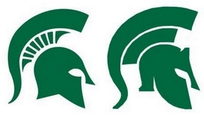
new logo design
On the left, the current Spartans' logo. On the right, the proposed new one.


Changing a logo is not a simple task, and it’s rarely even useful.

There are monetary concerns, for one thing. Changing a logo means that you have to replace the old logo by the new one on all products related to your company. This is a small concern for internet firms whose logo only appears online, but for a team like the Michigan State University’s Spartans, it means replacing all the uniforms, souvenirs etc.

However, even more importantly, when you alter your logo, it’s the whole image of your company that you change.

Read the rest of this entry »

Green Logos

January 10th, 2010

These days, global warming and ecology overall are quite the hot topics and there is no need to say that concern for the environment is a great plus for any company. So how can you show the world your desire to protect the planet?  Getting an appropriate logo is one of the ways.
It is far from true that a logo related to nature is not modern. A professional designer can make a “green” logo cool and edgy. The diversity of nature related logos is stunning as well. Below are a few neat examples of plant themed logos:
Trees are obviously a great theme, after all, what says “green” like a tree? As you will see, there is a great many ways to design a tree themed logo. This particular creator went for a realistic approach: the beautiful tree on this logo looks almost as if it was a photo.

Read the rest of this entry »

2012 Olympics logo belongs in the scrap heap

November 24th, 2009

London Olympic logo


So, designers came up with a bad logo. And when I say bad, trust me, I mean it. I have seen 5 years old kids draw things more beautiful than this “work of art”.

And the Olympic Committee somehow approved of that logo design.

And now, people don’t like it. For some mysterious reason.

And all the officials have to say is, “This is surprising”. Way to go, geniuses. I personally find nothing “surprising” in that reaction. This logo is bad. Did I mention that already? Yes I did. But allow me to mention it again, for when something is so mind-bogglingly horrible, saying it is bad just once is certainly not enough.

Read the rest of this entry »

Branding yourself: For better or worse?

March 24th, 2009

 Many important factors go into the creation of corporate identity. What colors are right for us, Fonts? There are many other questions that arise when one is working with logo designs. One question that tends to be overlooked is whether or not your design will be relevant in 5 or even 10 years. More importantly, once a company has established itself with a specific look, feel and brand, it becomes more and more difficult as time goes by to change it. Some companies have enjoyed success without ever having to change their brand image. Kentucky Fried Chicken has used Colonel Sanders in their logo ever since the company was founded. Aside from some updates on their marketing front; Nike would be another good example of a timeless brand-image. Pepsi took a risk in the mid 90s by completely changing their image and logo but did so with alarming success. However, it could have resulted in commercial suicide. If you'll remember, in the 1980's Coca-Cola changed their brand image to Coke. Pepsi then took over top seat in the market shortly thereafter. Some questions to ask yourself if you are thinking about redesigning your logo:

Read the rest of this entry »

Starting An E-Commerce Business

February 24th, 2009

Starting An E-Commerce Business: Baby Steps Starting your own e-commerce business can be quite the adventure. There is nothing wrong with falling head over heels in love with your ideas and plans and becoming overly excited. But always remember, feet first. Creating a business from scratch is like a child learning to walk. You need to grab on to something solid, feel around, get a sense of balance, and take baby steps. Risky Business Before running full speed ahead with your brilliant business brainchild, proper planning is required. Being an entrepreneur is risky business, however you can improve your chances of success with preparation and development.
Read the rest of this entry »

SEO: Who do you trust?

September 8th, 2008

Internet search engines exist to organize the seemingly immeasurable amount of information available on the web. They direct people to pages that are relevant to their searches, pages that discuss the exact keywords they are looking for. For businesses that receive the majority of their clientele from search engines, search engine rankings can make or break their business. Search Engines Search engine optimization (SEO) is a marketing technique that enhances a website and its content in order to increase the chances of achieving a high rank the search engine result pages (SERPs). Search engines are very secretive about their criteria and ranking systems as they continuously update and revise their algorithms (mathematical formulas used to determine which web pages are displayed in search results), and therefore there is less likelihood of webmasters and search engine optimizers being able to achieve higher rankings by manipulation and spamming. Every search engine has its own formula and criteria for indexing and ranking pages. One can analyze SERPs and backward links (all the links pointing at a particular web page) and attempt to determine a search engine's indexing criteria, however there's a lot of risk involved in relying on a limited number of optimization techniques. Because of the unpredictable nature of search engines, websites can easily move from a top ranking position on a SERP down to the third or fourth SERP or even be banned from the search engine altogether.

Read the rest of this entry »

Heart Warming Feature on CNN Money

March 13th, 2008

The article is a remarkable story about a young man with epilepsy who took a hobby of his and created a successful business called Anthony’s Beehive.  Montreal based graphic design company LogoBee, Inc was very proud to learn about their client’s recent feature in FORTUNE Small Business on CNN Money.    Anthony’s Beehive was a pleasure to work with on their logo design and website projects; and their journey is a touching story for all readers.
LogoBee was moved by the story of Anthony’s Beehive; the story hit close to home since the chief LogoBee coordinator working on their logo design and web design projects, Tim Liboiron, also has epilepsy.  Tim feels strongly that Anthony’s odyssey is a tale that needs to be spread.  Tim worked on this project vigorously to see Anthony receive the logo design and website that best portrayed Anthony’s Beehive.
The feature basically covers Anthony’s story starting from his birth and ending at running his successful business today.  Born with epilepsy, Anthony’s concerned parents Tony and Terri were worried about his future.  Tony returned to school so that he could get a teaching job in order to hire additional care for his son.  While in grade three Anthony asked his parents to add bees to the farm that they ran on the side.  His interest in bees and their honey led to selling honey to the local shops.  One day his parents noticed an entrepreneur course offered at the local high school.  The benefits of this course plus Anthony’s incredible people skills helped take his hobby and expand it into a successful business.  Anthony’s interest in bees and their unique produce was the reason for his creation of multi flavored lip balms which included the ingredients honey and beeswax.  This passion has kept Anthony experimenting with new lip balm flavors and has established Anthony’s Beehive with its twenty flavors of lip balm, as a fascinating business.
Please go to the CNN Money website to read the full feature on this remarkable business and the wonderful young man who lends it his name.  LogoBee urges all entrepreneurs to read this story for the inspiration required to make their dreams come true.  The article can be found at: http://money.cnn.com/2008/03/04/smbusiness/buzz_honey.fsb/index.htm

Read the rest of this entry »

LogoBee creates artistic logo design and website for LG Art Gallery

March 7th, 2008

Marketing has always been important to businesses and in the information society of today the internet is a necessity for all companies.  One of LogoBee’s recent clients realized this and has taken advantage of their various services.  LogoBee offers customers more than just custom logo design services; they also offer graphic design services for business stationery, brochures, flyers and web design.  This lets customers get professional design work done to satisfy all of their marketing needs.
Wesley Geys the VP of the L G Art Gallery contracted LogoBee to design a logo.  A contemporary and modern art gallery that sells paintings and sculptures located in Florida.  Beautiful art sells but a proper brand can help a company get recognized.  The abundance of graphic design information available on the LogoBee website; and straight forward explanation for getting started was very helpful in the beginning.  The constant customer support ensured that the proper design was created within a minimum amount of time.
Therefore, when Mr. Geys required the creation of a website for the L G Art Gallery he consulted the LogoBee website.  The available samples of past websites which were designed by the web team at LogoBee impressed Mr. Geys and he contacted them for an estimate on the website that he had in mind.  According to Mr. Geys, “The design process was fantastic.  It went really smooth and all the main items were discussed and understood before they went to design.” This led to a sleek website design and CMS which is easy to upload art that is currently for sale.  The logo design can be seen on the website and compliments the rest of the site beautifully.  Since the same company was used for both designs this was a natural occurrence.
Satisfying your clients should be the goal of any graphic design company and LogoBee strives to accomplish this with every project.  Mr. Geys was certainly satisfied and “would absolutely recommend LogoBee to anyone needing a logo design or website.”  If you are in need in both services, LogoBee would be happy to help.

Read the rest of this entry »