Home> Branding & Marketing

The Three Elements to a Solid Logo Design Plan

May 24th, 2013

By: Deborah Sweeney, CEO of MyCorporation.com

Nearly every small business owner knows how to plan – one of the first steps towards starting your own business is drafting a business plan. But few actually use that skill for anything beyond organizing their workday, or writing a proposal. Jobs like designing a logo really do benefit when the organic, creative process is focused with a plan. But since this is handled a little bit differently than that of a traditional business plan, what elements should be incorporated into a design plan?

Read the rest of this entry »

Branding… in more ways than one

May 10th, 2013

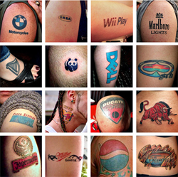
Why does Rapid Realty reward employees for getting the company’s logo tattooed anywhere on their body?


Image source: mix967.ca

The concept of the “human billboard” is not exactly novel. We have all seen people sandwiched between a couple of boards, or racers proudly wearing dozens of logos all over their clothes. It is only logical the next step would be logos tattooed directly on someone’s body.

Read the rest of this entry »

3 great misconceptions about logo design

April 20th, 2012

I don’t like any of the samples I have received! This company must be terrible!

multiple logo designs

Sometimes you can receive a group of samples that just don’t appeal to you, it happens. Most of the time a client doesn’t know or can’t precisely describe what kind of logo he wants or what image he is looking for. For that reason, a good designer will try to question the client as much as possible regarding their preferences and tastes in logos, but this is not always sufficient. Also note that sometimes an idea may seem good at first thought, but looking at the results on paper you could realize that you don’t like them at all. It is natural to get upset if you have received a package of samples that don’t suit you, but it`s important to understand that since you are not buying a premade product, bad surprises are not impossible nor improbable. Look at a batch of bad initial samples as just another step towards a great final design. It is highly unlikely that you will utterly hate everything about the samples presented. You can pick and combine different elements from them - font, color, object, layout – into one great logo. Even if the samples are really terrible, you could tell the designers precisely what you don’t like about them, which will help them avoid similar mistakes in the next samples. A bad batch of samples, depending on your view of it, can be a glass half empty or a glass half full. It’s a setback, perhaps, but the second round has a much greater chance of success.

Read the rest of this entry »

Logo Guide 2 (Abstract or Identifiable)

April 13th, 2012

logo designs

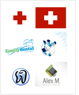
In this article, I wish to discuss some issues with abstract logo images and identifiable ones. We often get requests from clients asking to create an image that identifies their companies’ business. It is a perfectly proper request. But the client also wants it to be unique, something that no one else is using rather than a common and overused symbol. However, this creates a problem. What do you consider an identifiable symbol? A red cross, in North America, is associated with medical service and ambulance. When you see this symbol you recognize a medical service, despite the fact that it doesn’t show a hospital bed, a doctor treating a patient, or a car driving to a hospital. Most identifiable symbols do not really show the service, yet they are so commonly and often used that they become a standard. Now let’s get back to the client’s request. Take for example a dentist. What are the most common and standard symbols identified with dental health? A tooth and a toothbrush, obviously. When a designer receives a request from a dentist who wants an identifiable logo for his business, but doesn’t want to have overused symbols such as a tooth and a brush, what exactly is the designer to do?

Read the rest of this entry »

Logo Guide 1 (Complexity)

April 9th, 2012

There is a big debate over the complexity of a logo. There are some obvious benefits to simple logos. They are by far the most versatile and easily identifiable. Just look at the logos of Apple, Sony, Honda, Nike, or Guci.
simple logo designs


These logos are easy to reproduce in any size and any color, even black and white. They are easy to embroider or emboss on nearly any apparel or material. These logos are easy to make out from afar and easy to identify.

Not everything about simple logos is so great, though. It is extremely difficult to come up with a new shape and make it interesting. If you look at Nike’s logo, it is not a piece of art per say, but it is a unique shape, which makes the logo timeless and original.

From a client’s point of view paying money for a simple square or half a circle just isn’t worth it. We often hear our clients say: “Well this is not very creative” or “I could have made the same logo myself”. Indeed, simple logos (sometimes just a letter or a simple geometrical shape) just don’t look like much work has gone into them. And yet, take a look at the most famous and recognized logos out there: IBM, JVC, Google, DELL, IKEA...
logo designs


Read the rest of this entry »

What makes a great logo design

March 30th, 2012


1)      The company’s name is the inspiration for a lot of great logos!
What do the logos of Apple, FireFox, Taco Bell, Shell, Puma all have in common?
logo designs


All of these logos include an identifying object directly related to the name. This technique presents its own benefits and challenges. The benefits are obvious: it is very easy to identify the company name just by looking at the symbol and it makes the logo look clever. It also makes it memorable. The challenges come into play if you have a company name similar to that of one already on the market. How do you make your “apple” look different?


2)      There are logos with a recognizable object not associated with the company name.
For instance, Playboy, Starbucks, Lacoste, Bacardi, Michelin, Peugeot...
logo designs


These logos have an identifiable image not related directly to the name of their company. This is really not less effective than the previous way, and many successful companies use this technique. Some of those logos have a hidden meaning or a story behind them, but if you don’t know that story already, it is usually hard to connect the dots: why is there an alligator on a fashion garment, exactly? Others can be related to the enterprise’s field of business. The Michelin Man logo was a great success. Even though it has no story behind it, it does convey the feel of a company producing tires filled with air. Usually, it’s very difficult for a designer to come up with an identifiable image not connected to the company name without getting some kind of story or meaning behind the concept.

Read the rest of this entry »

Build your Brand Identity with Promotional Products

March 21st, 2012

One of the most important things for any business is to develop a brand. A brand is made up of a combination of everything your business entails, including; customer service, product quality, marketing materials, and of course, the logo. A brand is the way customers perceive your business and service as a whole. The logo on the other hand, is what identifies a business or product. It is the trademark symbol that quickly identifies who you are.

Read the rest of this entry »

The Power of Promotional Items

March 7th, 2012

logo designs in promotional items

Having an eye-catching company logo is a great start to promoting your business, but how do you plan to connect with your target demographic once you have the logo? How will potential customers learn about your business? Traditional advertising media—television, radio, and print ads—can be cost-prohibitive for small businesses, and marketing on the Internet is easier said than done. That's why promotional products are such an attractive alternative to businesses just starting out.
 

Promotional Items Advertise When You Can't

We have all seen promotional items—custom t-shirts, printed coffee mugs, personalized water bottles, and so on—but have you stopped to consider just how powerful they are? For example, in the Advertising Specialty Institute's annual Impression Study, the organization found that the standard tote bag registers over 1,000 unique impressions every month! What's more, such items are often perceived as less "pushy" than traditional advertising forms. Indeed, promotional items represent the most effective form of ambient advertising available today.

Promotional Items Are Cost-Effective


To extrapolate the example above a little further, let's say each promotional tote bag costs $2. This would put the cost per impression at 0.002 cents a piece. When considering the life of the bag can run upwards of 2-3 years, the products become even more cost-effective. When comparing that to the cost of running a television ad, renting a billboard, or running a pay-per-click campaign, it's easy to understand why so many businesses employ promotional items as one of their marketing methods.

Promotional Items Drive Business


In addition to being cost-effective and effective ambient advertising, promotional items can also contribute directly to additional business for your company. The ASI study mentioned earlier also found that recipients of a promotional item were at least 50% more likely to do business with the company that had sent it. If that weren't enough, in simply receiving the gift, recipients' opinions of the company also improve. So whether your business wants to stir up some goodwill among your client base or needs to generate more sales this quarter, make sure you think strongly about ordering promotional items.

Read the rest of this entry »
Back to the start?

February 28th, 2012

Microsoft Windows 8’s simplistic logo ushers tough times for logo design companies.
Windows 8 logo


If you wish to receive a brief history of logo design fashion and graphic program capacities, all you need to do is to take a look at the gallery of Microsoft Windows’ logos. Read the rest of this entry »

Logobee is seeking creative writers and editors

November 17th, 2011

Creative writers and editiors wanted


Logobee is seeking creative writers and editors to write and publish blogs, features, or articles with a design theme. The main criteria for the material are to be original and oriented towards graphic design. Primarily logo design, stationery design, web design, print media and visual media design. You may include your credentials, but articles must contain LogoBee credentials as well, with a direct link to Logobee's home page,http://www.logobee.com. Besides writing the post you must also publish it online. We are willing to pay 20$ to 200$ per release, based on the originality of your post and its online placement. We are mostly targeting existing or future editors of diverse online media, blogs or forums. Upon request we can also provide you with some ideas for the post. LogoBee is a highly professional design firm with over 11 years of experience in the field. We have designed thousands of logos and brand identities throughout the world, and hundreds of websites. LogoBee has designers with over 25 years of experience in the field, and has a very deep knowledge of the subject. We believe this collaboration can produce very unique and useful material for the public. If you are interest please send us a message

Read the rest of this entry »

Custom Logos and Business Checks Make Marketing Magic

November 5th, 2011

When it comes to branding your small business…it's a dog eat dog world out there!

Potential customers and clients are being bombarded by hundreds if not thousands of media messages every day. The savvy small business owner should seize any opportunity to grab the attention of the public and make a lasting impression.

Read the rest of this entry »

LogoBee's Top 10 Logo Design Tips

July 10th, 2011

Over the years, LogoBee has been designing logos and accumulating articles and resources for its clients. Finally, they've released a concise set of logo design tips to help you along with your project, and ensure that you end up with a logo that will perfectly suit your needs. So without further ado, here are LogoBee's top ten tips!

Keep it Simple!

These are probably the best words of advice, and it ties into almost all of our upcoming tips. A complicated logo will not only make your logo difficult to reproduce and maintain, but you will also fail to engage your audience. The logo is the ultimate 'elevator' pitch to your potential clients and business partners. You don't have time to recite your entire business plan in an elevator pitch, and the same concept applies to corporate logo design.

Read the rest of this entry »

Getting to the details-Let's look more closely!

July 9th, 2011

After making sure that you are dealing with a legitimate company there are few more points to look at:

-There are two different types of logo design companies that exist on the Internet:

One is a company that sells pre made logos. What they do is very simple. They design a collection of logos related to a particular field of business and if you like one of them you can buy it. These logos are mostly iconic logos, or have a special font in it. There is usually very little work done on these logos and are the cheapest that you will find. There are downsides to going this route. First: you have to be very cautious about registering or even thinking of registering this type of logo. These are pre-made logos and usually are sold to many different clients simultaneously which means you may not be the only company that owns the logo.

Read the rest of this entry »

Which logo design company to choose

June 29th, 2011

Beware!

In the last 5 years, we have seen a prolific growth in the Internet industry. Every conceivable field of business has seen the advantages the internet has to offer. One of these industries is logo design , which interestingly is considered to be the fastest growing in the world. You can now order any type of design from the comforts of your home or office and everything is presented to you in a timely manner.

With every moral, prosperous company out there - there are plenty just waiting to take advantage of you.

Read the rest of this entry »

Company name

June 22nd, 2011

You have developed your business idea, finished your market research, and now you need to decide on a name. The name must earn your potential customer's attention and trust. Start considering names in the beginning stages once you have determined your field of business. Use a serious name for a serious company. Use a fun name for creative company or a company that markets children.

Before you finalize your company's name, consider logo design concepts. They are difficult to capture on the first try. This is why a company should provide a designer with more information than just the company name. Consider the type of qualities you would like your company to portray. There are various logo design styles that portray different qualities. If you want to represent a very aggressive, high tech, corporate, and cutting-edge company, you should not come up with the name like 'Sloopy' or 'Scroochy'. Belive it or not, some of the names for clients in the past have been so inappropriate that it is not worth mentioning. The logo would look like Tinker Bell in a hockey Helmet!

Here are a few of the most important rules to consider when coming up with the best possible name:

Read the rest of this entry »