New Brooklyn College President rejects phallic logo
August 21st, 2013
Businesses often decide on a change of image when a new leader takes the reins – out with the old and in with the new in more ways than one, so to speak. This was certainly true when Karen L. Gould became the new President of Brooklyn College, a higher education institution that forms part of the City University of New York.

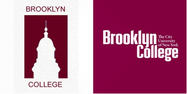
According to sources, Gould, the first female President in the college’s 80-year history, felt that the former College logo – a silhouette of the campus’ imposing Georgian clocktower (see below left) – was “too phallic”.
LaGuardia Hall, erected in the 1930s, and which today houses Brooklyn College’s library, had been a feature of the logo for the past 10 years. Previously, it was seen to represent the College’s reputation for not only being one of the most iconic and beautiful college campuses in the United States, but also for being “the poor man’s Harvard” – academically excellent but with lower than average tuition fees.
Within months of her appointment however, Ms Gould felt that a design overhaul was needed and she contracted with Neustadt Creative Marketing to design a new logo. According to the designers, the new typographical logo (see above right) is a “fresh, youth-oriented design that would help the college stand out in the brand chaos of New York City”.
Some college professors have welcomed the change of image, particularly those in the School of Education who immediately requested to use the “not-so-phallic” logo on a banner for Womens’ Studies.
There have of course been critics of the new logo. Though few comments have been made about the design itself, or indeed about the apparent feminist motives behind the new look, controversy was courted when it was revealed that the new logo cost $107,000 US dollars to develop – a hefty price tag even given the fact that the typeface had been “sculpted specifically for Brooklyn College”. A spokesperson for the College insisted that no public funds, or money from students’ tuition was used to fund the redesign, but she remained tight-lipped about where the money actually came from. Furthermore, the College’s own – cheaper – in-house creative team is angry that they seem to have been snubbed in favor of an agency based hundreds of miles away in Baltimore.
Rumors abound that some kind of ‘deal’ may have been struck with a private investor, but then again perhaps this outsourced approach is simply in keeping with the College’s motto: Nil sine magno labore – “nothing is without great effort”.
Do you think the old Brooklyn College logo was ‘phallic’? What are your thoughts on the new logo? Do you think the College was right to appoint an out of town agency rather than utilize its in-house expertise?


