Netflix's New Logo: Double Trouble?
June 28th, 2016

Seems like the lion’s share of the articles in our blog consists of a) companies replacing their iconic logos by more app -friendly ones (usually to the great displeasure of the public) and b) logo design plagiarism controversies. So today, as a special treat, we’re covering a case that merges both! Except the logo is not actually being replaced. And there’s not really a plagiarism controversy. Don’t worry, it will all become clear in a moment.
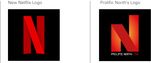
Indeed, while big-name streaming website Netflix did unveil a new logo a week ago, it does not plan on scrapping the old one entirely, which may be why any controversy over this news is far more moderate than in the cases we have previously covered. And admittedly, Netflix’s full-text logo is far too wide to translate well as an icon, so an update was sorely necessary. In contrast, the new icon is simply a crimson ribbon on a black background, shaped into the letter “N”.
However, independent UK publishing company Prolific North fears that Netflix’s new logo “commercially could become an issue” since it closely resembles their existing logo. As a breath of fresh air in an environment where mud-slinging over probably unintentional logo similarities is rather common, Prolific North publisher Nick Jaspan acknowledged: “I don’t believe for one minute that they copied our logo, they wouldn’t be so crass to do that, but someone has come up with a good idea and it hasn’t come up on the image search”. Nevertheless, the smaller company fears that the similarity of their logo to Netflix’s icon could have a negative impact, though they would prefer to avoid engaging the streaming giant in a legal battle.
Meanwhile, experts and laymen alike are still trying to determine whether Netflix’s new icon represents a red carpet, a celluloid film print, or simply (as some assert) a pretentious and meaningless mess. What do you think of the logo, and what do you think it means?
About the Author:
Daniil Stoenko is a professional writer and translator who produced a variety of articles for LogoBee’s Logo Design Blog over the years.


