IKEA logo concept makes perfect sense
December 4th, 2015
The logo of everyone’s favorite Swedish flat-packed furniture retailer has changed very little since 1967. Though once-upon-a-time black and white, and for a short time red and white, the familiar blue workmark inside a yellow oval has been IKEA’s trademark since 1983.

But Scottish design firm Freytag Anderson thought it was time for a rebrand. In a recent issue of Icon Magazine, the design firm showcased its ideas for a new Ikea branding concept – and you know what? It makes perfect sense.

Not only has the logo changed very little in over 30 years, the oval shape also constricts the readability of the company name when printed small. In today’s digital age, a fully scalable logo is a must in order to take advantage of the different kinds of media available.
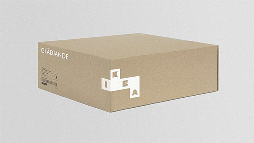
Retaining the Swedish color scheme that has become synonymous with the brand, Freytag Anderson’s concept reflects the versatility, modularity and configurability of IKEA’s very own furniture. It places the letters I, K, E and A into building blocks, which can be reconfigured and wrapped around packaging according to suit the particular furniture item being packaged. Here are some examples of how it might look.


I think this modular concept is perfect for the IKEA brand. IKEA bosses: take note!
About the Author:
Although her primary niche is in scientific writing and editing, freelance writer Lisa Martin is also a creative type with an eye for design. She regularly works alongside graphic designers and as such has a keen interest in the development of logos and branding.


