Facebook logo design quietly revamped
July 22nd, 2015
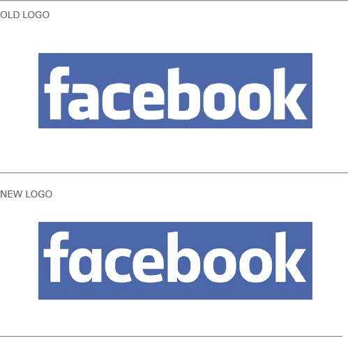
Blink and you might have missed it, but social media giant Facebook changed its logo recently and you probably didn’t even notice. There was no fanfare, no press release, no social media campaign. In fact, comparing the old and the new designs, you could be forgiven for wondering what’s changed!

Take a closer look. You’ll find the contours of the letterforms are slimmer and more rounded, the letter ‘b’ now has a tail, and the ‘a’ has changed from a two-storey shape to the single-storey version.
The logo design modifications are so subtle that they’re hardly ground-breaking, so why did Facebook even bother at all?
According to Facebook’s Creative Director Josh Higgins, the refresh was intended to “modernize” the logo and “make it feel more friendly and approachable”. Reviewers such as Howard Belk, Chief Creative Officer at branding agency Siegel+Gale also suggest that while the formerly squared-off letter shapes worked well on computers, the increasing move to mobile internet technology favors a more rounded font.
“It’s a utility driven change, clearly to optimize the logotype for mobile devices, which is really key to Facebook’s business strategy,” Belk said. “They’re recognizing that the overwhelming majority of people see [the site] on a backlit screen, and most of those screens are small.”
What do you think of Facebook’s ‘new’ logo? Do you think it was necessary to make these small, subtle changes?
About the Author:
Although her primary niche is in scientific writing and editing, freelance writer Lisa Martin is also a creative type with an eye for design. She regularly works alongside graphic designers and as such has a keen interest in the development of logos and branding.


