3 great misconceptions about logo design
April 20th, 2012
I don’t like any of the samples I have received! This company must be terrible!

Sometimes you can receive a group of samples that just don’t appeal to you, it happens. Most of the time a client doesn’t know or can’t precisely describe what kind of logo he wants or what image he is looking for. For that reason, a good designer will try to question the client as much as possible regarding their preferences and tastes in logos, but this is not always sufficient. Also note that sometimes an idea may seem good at first thought, but looking at the results on paper you could realize that you don’t like them at all. It is natural to get upset if you have received a package of samples that don’t suit you, but it`s important to understand that since you are not buying a premade product, bad surprises are not impossible nor improbable. Look at a batch of bad initial samples as just another step towards a great final design. It is highly unlikely that you will utterly hate everything about the samples presented. You can pick and combine different elements from them - font, color, object, layout – into one great logo. Even if the samples are really terrible, you could tell the designers precisely what you don’t like about them, which will help them avoid similar mistakes in the next samples. A bad batch of samples, depending on your view of it, can be a glass half empty or a glass half full. It’s a setback, perhaps, but the second round has a much greater chance of success.
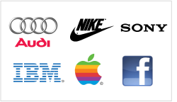
Those samples are so simplistic… I could have drawn this myself! What a waste of money! This is another complaint we often hear: “It is not creative enough I could have drawn the same thing myself!” If you think about it, the logos of most famous companies are simple: Sony, Audi, Nike, Apple, Facebook, IBM and many more. It is important to keep in mind the designers’ assignment. A simple logo is not equivalent to a zero-effort logo! Behind every good logo, complex or not, there is an idea. Sure it might look simple, but can you be sure simplicity is not exactly what your logo needs? Keep in mind that a good logo designer listens to your suggestions and tries to produce logos in accordance with your tastes. If you do like the style of Sony or Apple, don’t be surprised when you receive many simple-looking samples that anyone can reproduce quickly. Don’t mind the lack of complexity, pay attention to the variety. Remember that a good logo is not one that is extremely complex or even clever – a good logo is one that people remember. Most brilliant ideas in life are simple. Nike’s logo is extremely simple, but it fits the company very well. Anyone could have come up with the symbol, but no one HAD.
A logo that looks like Clipart is a bad logo. By definition Clip art, in the graphic artist’s vocabulary, refers to pre-made images used to illustrate any medium. But logos are technically the same thing! The only difference is that Clip Arts are premade graphics: scrap logo images, or parts of illustrations. It is really hurtful to hear customers say: “your samples look like Clip Art…” Of course they do, especially when the client asks for it himself. The outcome of the design is based on the client’s initial request. If you are asking for any particular image or scene separated from your company’s name the logo automatically adopts all the properties of Clip Art, which is an image illustrating any medium that can be attached to any text or a document. My suggestion is to think before ordering a logo design: how do you want your logo to be used? If you do want to have an image separate from your company’s text, it would technically be a clipart.


