Home> Logo Design

Netflix logo “refreshed”

May 16th, 2014

Movie rental subscription service Netflix has been around now for almost twenty years. A lot has changed during that time; mostly recently Netflix’s logo design.

When Netflix first started, the only way you could use it to watch movies and TV box sets was to create a wishlist of titles online, and then wait for the physical DVDs to be delivered to your door. Back then, in the late 1990s, Netflix’s logo was designed to catch the eye among the other envelopes that arrived in the mail; it was all bold, shadowed type and a bright red, black and white pallette.

Read the rest of this entry »

PayPal’s new logo design no longer resembles a car park icon

May 8th, 2014

In a recent brand survey conducted on behalf of money exchange giant PayPal, findings indicated that most people recognise PayPal as a brand and something to do with online money, but few were sure of what, exactly, PayPal actually does…

And so with the launch of a new mobile payment service, PayPal has taken the opportunity to refresh its image with a new logo design.

Read the rest of this entry »

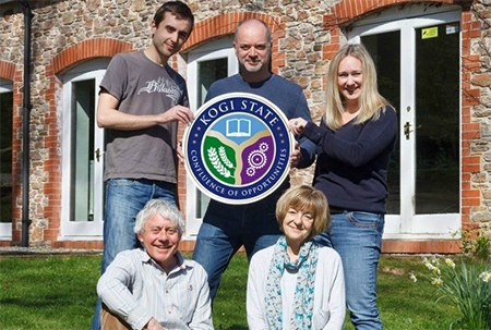
Small UK logo design company wins African royal seal of approval

May 7th, 2014

The south-west of England is generally considered a sleepy part of the country. Far away from the hustle and bustle of the capital, London, it’s more renowned for its beaches, laid back lifestyle, and lack of highways.

Read the rest of this entry »

New logo for the city of Halifax

April 30th, 2014

The Canadian city of Halifax is the latest to join the growing trend for new logos.

Commissioned by Halifax Regional Municipality and designed by branding agency Revolve Branding, the logo is part of a whole new branding strategy, which was unanimously supported by members of the Executive Standing Committee.

Read the rest of this entry »

Crowdsourcing logo design – does it work?

April 17th, 2014

Everyone’s crowdsourcing everything these days, raising money for community projects, taking part in charity events, funding scientific research – the list goes on. Crowdsourcing seems to have become trendy in the logo design world too, with a number of organisations using the method as a way to generate novel ideas, engage with members of the public or a particular community, and to kickstart a self-perpetuating marketing campaign.

In 2013 municipal governors of the Italian city of Florence decided to go down the crowdsourcing route to come up with a new brand identity for the city. The competition, open to both professional and amateur designers, encouraged entrants to submit logo design ideas, in sketch format, to rebrand Florence as an international tourist destination.

Read the rest of this entry »

New logo design for the ‘City of Neighbourhoods’

March 14th, 2014

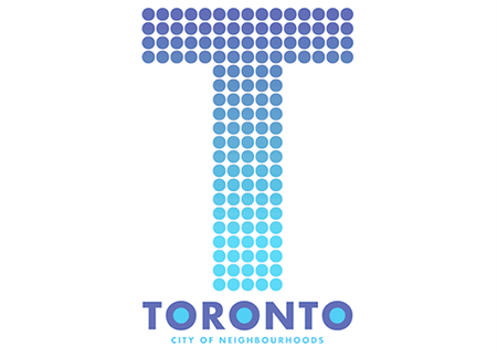
We recently reported on the underwhelming response to the announcement of a new logo for Canada’s 150th birthday. Following this, Canadian national newspaper The Globe & Mail recently launched a competition to see if Canadian designers can come up with a better alternative to the existing logo for the city of Toronto.

You can view the eight logo designs shortlisted by visiting The Globe & Mail wesbite here. However, the one logo design that received the most votes from a public poll is this one, by Matthew Blackett of Spacing Media:

Read the rest of this entry »

New logo and new products for new world wine company Jacob’s Creek

March 12th, 2014

Australian winery Orlando Wines, based in South Australia’s Barossa Valley, recently announced that the Jacob’s Creek brand would be getting a new look after almost 40 years.

Read the rest of this entry »

Out with the ampersand, in with the plus – Black & Decker logo design becomes Black + Decker

March 7th, 2014

What is the first thing that comes into your mind when you hear the words “Black and Decker”?

For me, and most people, according to a recently commissioned survey, the name conjures up images of drills, electric saws and the classic Black & Decker workmate bench – all branded in trademark orange.

Read the rest of this entry »

Controversial Cape Town logo design goes ahead despite opposition

February 28th, 2014


From my own travel experience, Cape Town is a city of contrasts. As a vibrant, modern city – the second most populated in South Africa after Johannesburg, Cape Town glitters in its sunny seaside position and is overlooked by the breathtakingly beautiful Table Mountain.

There is art here, and culture, music, museums, botanic gardens and entertainment,  a gaudy student drinking culture and backpacker scene, and the ramshackle yet colourful and lively township shanties. Diverse ethnic groups have made their home in Cape Town: Khosa people, Zulus, Cape Malays and white Africans of Dutch, German and British heritage to name but a few.

But Cape Town also has its dark side.

Read the rest of this entry »

Sochi Winter Olympics’ digital logo design

February 21st, 2014

The decision to host this winter sporting spectacle in the Russian Federation has been well criticized, particularly by the lesbian, gay, bisexual and transgender (LGBT) community and its supporters who are protesting over Russia’s strict and highly controversial anti-gay laws.

Unlike it’s country’s politics, and unlike the much-discussed and hotly debated logo for London’s 2012 summer Olympic Games, the logo for Sochi 2014 seems to have slipped under the global radar. Nothing much has been said about it in on or offline media – in fact the world seems to have collectively shrugged and given a unanimous, “Meh!”

What do you think of the logo design?

Read the rest of this entry »

Bruce Yan gives familiar logo designs a cartoon makeover

February 6th, 2014

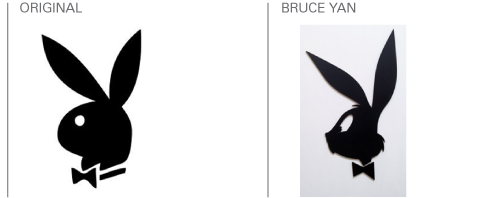
Bruce Yan is a graphic artist who takes familiar logos and icons and reimagines them with cartoon characters from our childhood. Sadly, you’ve just missed his first ever solo art show, which was held in Los Angeles on February 1st, but he has been getting a lot of attention on the internet so I’m sure it’s not the last we will see of him!

In Bruce Yan’s world, the Playboy bunny, associated with the adult world of Hugh Hefner’s hareem of glamour girls, becomes childlike and innocent in the form of Bugs Bunny.

Read the rest of this entry »

Designers respond to the launch of Squarespace Logo design app

February 5th, 2014

Squarespace has a great reputation for providing high quality websites. However, that reputation recently took a pounding from members of the design community after the web space company announced the launch of Squarespace Logo.

This tool, which seems quite similar to Canva – a service I have written about previously on the LogoBee blog – allows users to design their very own simple logos, and download these as hi-res Photoshop files for the bargain sum of $10 USD.

Read the rest of this entry »

Oscar's new logo design

December 19th, 2013

Oscar is the man that every actor wants on their mantlepiece. A gold statuette awarded by 6000 members of the Academy for Motion Picture Arts and Sciences is considered the top accolade for not only actors, but screenwriters, directors, producers, score composers, special effects teams, animators and more.

Ahead of the announcement of the 2014 Academy Award nominations on January 16, the Academy has also announced a new logo design.

Read the rest of this entry »

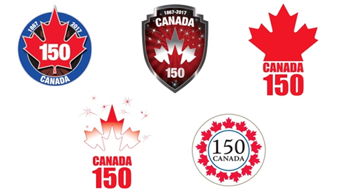
Canada’s 150th birthday logo design courts controversy

December 11th, 2013

Happy birthday Canada! Well, almost. The independent state of Canada turns 150 years old in a few years’ time and Canadian Heritage has commissioned a new logo design to celebrate this momentous occasion. But how do you represent ‘Canada’ in a logo?

Like this, apparently.

Read the rest of this entry »

New logo design for Oregon state

December 3rd, 2013

I recently wrote about the innovative way in which the US state of Colorado crowd-sourced its new logo from native Coloradans – and the underwhelming response that the new logo receiveddespite its user-led approach.

Now it’s the state of Oregon’s turn to reinvent itself – but has it done any better than Colorado?

Read the rest of this entry »