For DFW, orange is the new blue
October 7th, 2015
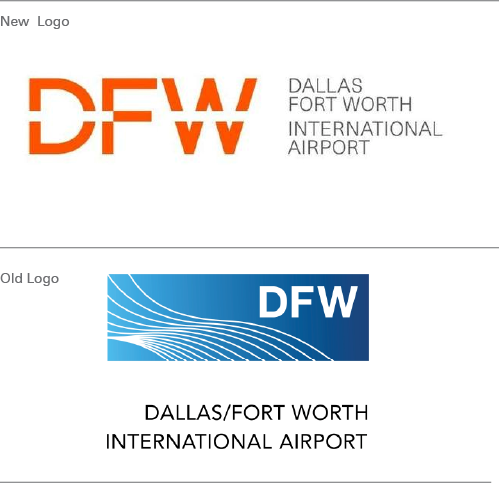
This week, Dallas Fort Worth airport launched a new logo – the first major redesign of its branding for 14 years.
DFW has grown from a small domestic airport to an international travel hub with millions of passengers passing through each year – the ninth busiest airport in the world. “We needed to evolve our brand to be more modern, memorable, unique and – critically – global,” said airport chief executive Sean Donohue, during the launch event.

The Interbrand redesign, which features a change in pallette from blue to orange and cost $1.5 million, will be rolled out across the airport over the next three years, including on the inter-terminal Skytrain, airport signage and interior design, staff uniforms, and the company’s website. A new strapline: “Travel. Transformed” will also be used.
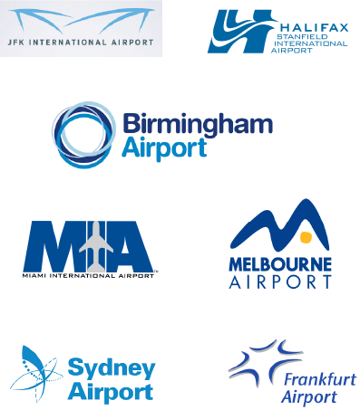
Something else Donohue said intrigued me: “Airports all over the world are blue,” he said. “Well, we’re changing and our new color draws insipirations from the color of the sunrise and marks the new beginnings that travel brings.”
It’s not something I’d ever really noticed before, but a quick Google Image search confirmed that, indeed, many airport logos are blue! I suppose it’s a nod to the color of the sky, or perhaps to the oceans that airplanes cross, but I wonder why few airports have thought outside of the box in terms of their color scheme?

Why so blue?


