YouTube chooses metro design
September 4th, 2013
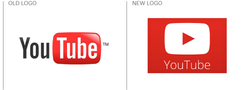
A new version of YouTube’s logo has started to appear on some of its social media profiles, including its Twitter and Facebook pages, and on the new versions of its Android and iOS apps. The design, a crisp, clean, flat red play button, is very much in the ‘metro’ style – popularized by Microsoft and perhaps best explained in Microsoft’s own words:

Although YouTube has said that the new logo will not replace the old one (below), the idea is apparently to help create a simpler identity that will work better as an icon.

This is something that is becoming more and more important in a mobile app-driven world where icons vie for shortcut space on your tablet or smartphone. The hope is that users will see the red play button on their device and know that it is YouTube, without even needing the name of the brand underneath – and this is a concept that has in fact already been used to great effect with two of Google other app/cloud-based brands, Chrome and Drive (below).

It’s a more than feasible plan. YouTube, originally created by three PayPal employees in 2005 and bought out by Google just over a year later, is a highly popular and recognizable brand that hasn’t changed its logo much at all over the years. In fact, although other video sharing sites such as Vimeo exist, YouTube is very much the number one go-to website (or app) for all your sneezing baby panda and cute-cat-video needs; “to youtube” has become almost as strong a verb as “to google”, and there is good reason to expect that tapping the big red play button will be as synonymous with YouTube as the name itself.
About the Author:
Although her primary niche is in scientific writing and editing, freelance writer Lisa Martin is also a creative type with an eye for design. She regularly works alongside graphic designers and as such has a keen interest in the development of logos and branding.


