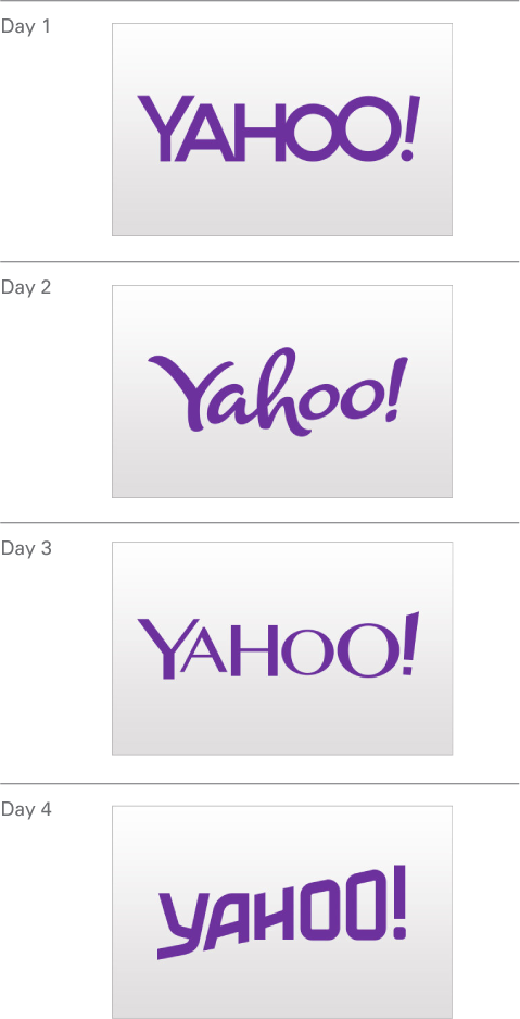
Yahoo! Showcases Thirty Logos in Thirty Days
August 14th, 2013
Internet search engine company Yahoo! has announced that it will soon be replacing its distinctive purple ‘exclamation point’ logo, but it will showcase a different logo every day before choosing the final design.
Yahoo! was founded back in 1995, right around the time that having access to the internet at home started to become popular with consumers. In the first year, the young start-up company experimented with some brightly colored designs (see below), which incorporated the signature exclamation point. As the brand became more popular – remember, this was before the days of Google, so Yahoo! quickly became one of the most popular internet search engines – it wasn’t too long before an established logo was introduced (see below).
The red typographic Yahoo! logo of 1996 remained with the company for the next 13 years, changing only slightly in 2009 when the red color was ousted in favor of a bolder purple hue.

Now, for the first time since 1996, Yahoo! is changing its look, but wants to create public interest and seek opinion before confirming the logo choice. To this end, visitors to the US Yahoo! homepage between August 7th and September 3rd will find a different Yahoo! logo each day, until the final decision is announced at 9pm (US Pacific Time) on September 4th. You can view a YouTube video of these designs here: http://youtu.be/agRxG-X_TEQ.

So why this approach to choosing a logo design? Yahoo!’s Chief Marketing Officer Kathy Savitt has been reported as saying that, “While the company is rapidly evolving, our logo – the essence of our brand – should too… It’s a way of having fun while honoring the legacy of our present logo.”
But some industry experts have criticized this approach, asking: who really cares about 30 different logos? Yahoo! has already decided that the purple color and the exclamation point will stay (as well as the ‘yodel’ sound bite), so are 30 different logos going to be anything more than the same thing in 30 different fonts?
Branding expert Laura Ries of Ries and Ries thinks the ‘30 days of Yahoo! logos’ concept is a bad idea: “It will confuse people”, she said “and make mush of any visual identity the brand had left in the mind before revealing the new look”. Others agree, saying that if Yahoo! is going to change its logo, it needs to take some advice from another mega-brand Nike and “Just Do It”.
Forrester analyst Jim Nail goes further than the logo and suggests that Yahoo! has bigger problems than just their design. Despite Yahoo! having acquired popular brands such as photo sharing site Flickr and blogging platform Tumblr, and expanding into tablet and mobile apps, Nail says the company name, the exclamation point and the fact that it still yodels after more than 20 years is “at best Web 2.0 if not Web 1.0. It’s a bit dated”.
What do you think about this approach to logo design? Of course, it’s a PR stunt, but will it be effective?


