Why do colors look different between monitor and print?
July 29th, 2015

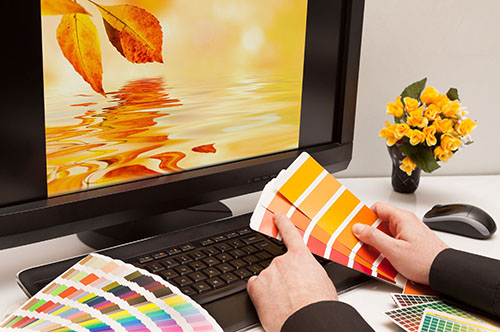
Let’s start by analyzing our computer setup. First of all, there are different monitor brands and different video processors. Each comes with its own abilities to reproduce colors and brightness, determined by its hardware. Additionally, there exist all sorts of software setups, such as the monitor’s color mode, the color calibration of your computer and the video card software. This is why colors may look different from one monitor to another.

RGB colors

CMYK colors

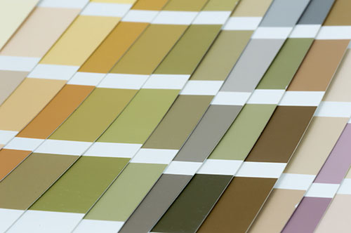
Pantone Colors Book
Now, let’s review how the computer monitor works. There are 3 essential color modes in graphic design: RGB, CMYK, and spot colors (Pantone). All monitors work on the same principle, which is the RGB mode. Red, Green and Blue lights are used to reproduce the right color mix. Combine all 3 and you get white, turn off all the lights and you get black. Because the monitor emits light, most of the RGB colors look bright and vivid. This is opposite to CMYK and Pantone, which are printed on a paper and actually reflect ambient light. Therefore, you cannot precisely reproduce RGB in print and vice versa, as it is hard to reproduce printed colors on a monitor screen. Even when using simulated CMYK colors on a monitor, the result on paper may still look different. Furthermore, different printer brands and printer settings may result in a different outcome in printing CMYK color.
We have finally come to looking into spot colors - Pantone. This is a standard color brand used by many professional print shops. The paint color used in Pantone printing is always the same in every print shop you go. This is why it is the preferred method of printing business cards, stationery and logo. However, because monitor colors are all different, it is practically useless trying to look at Pantone colors on a screen. Graphic design studios that only work on digital media can only provide a reference Pantone number. You should seek a book store or go to a print shop to view and approve the color in the official Pantone book.


