Tourisme Montreal highlights its accents in logo design rebrand
May 1st, 2015
I haven’t had the pleasure of visiting Montréal, home of LogoBee’s HQ, but a recent rebranding of the regional tourism board has made me want to visit!
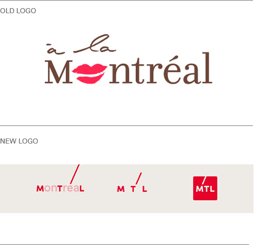
Arguably, Tourisme Montréal’s previous logo – ‘à la Montréal’ (see below) was a little dated and tired. When I first saw it, I was perplexed by the lipstick ‘kiss’ – it seemed rather feminine and thus confusing as to who the logo was meant to appeal to. I also thought the lipstick made the more difficult to read.

All that has changed with a fancy new restyle by agency LG2. The new Tourisme Montréal logo is bold, easy-to-read, gender neutral and very digital-friendly, as this video shows.
Whereas ‘à la Montréal’ seemed somewhat old-fashioned, the new brand uses the accent over the letter ‘e’ to highlight seven key events across the Montréal calender to attract visitors from all walks of life at all times of year. It focuses on the idea that despite its history, Montréal is a hip place to visit; it’s young at heart and home to vibrant community of talented, creative people. It’s clever, cool, and very social media-friendly with the shortened ‘MTL’ version tying in perfectly with the official Twitter hashtag ‘#MTLmoments.’
Well done Montréal, I like it and I hope to see you soon!
What do you think?
About the Author:
Although her primary niche is in scientific writing and editing, freelance writer Lisa Martin is also a creative type with an eye for design. She regularly works alongside graphic designers and as such has a keen interest in the development of logos and branding.


