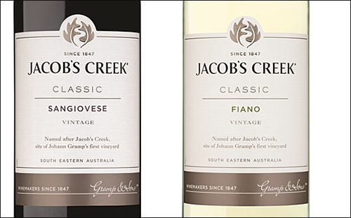
New logo and new products for new world wine company Jacob’s Creek
March 12th, 2014

Australian winery Orlando Wines, based in South Australia’s Barossa Valley, recently announced that the Jacob’s Creek brand would be getting a new look after almost 40 years.
Although there is little perceptible difference in the typographical element of the best-selling brand name’s new logo, from March 2014 consumers will find a newly created ‘twin leaf’ design on the front of the bottles. The two leaves represent the winery’s vines, while their configuration causes the optical illusion of a ‘creek’ to appear in between the leaves. I think it’s simple, but quite clever!
According to Jacob Creek’s Head of Marketing, Lucy Bearman, “Our new brand icon will allow us to have a single premium, contemporary look across our whole portfolio and will enhance our connection with modern consumers.”
Alongside the new logo, Jacob’s Creek – which is owned by Pernod Ricard – is also launching some new wine products, including a Sangiovese red and a Fiano white; the result of a 20-year planting programme to develop new Mediterranean grape varieties grown on Australian soil. It is also said to be a response to changing trends in consumer habits, including increased ‘daring’ to try new wines and tastes.
Although her primary niche is in scientific writing and editing, freelance writer Lisa Martin is also a creative type with an eye for design. She regularly works alongside graphic designers and as such has a keen interest in the development of logos and branding.


