Logo Guide 2 (Abstract or Identifiable)
April 13th, 2012

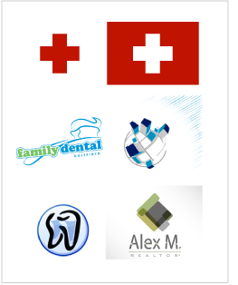
In this article, I wish to discuss some issues with abstract logo images and identifiable ones. We often get requests from clients asking to create an image that identifies their companies’ business. It is a perfectly proper request. But the client also wants it to be unique, something that no one else is using rather than a common and overused symbol. However, this creates a problem. What do you consider an identifiable symbol? A red cross, in North America, is associated with medical service and ambulance. When you see this symbol you recognize a medical service, despite the fact that it doesn’t show a hospital bed, a doctor treating a patient, or a car driving to a hospital. Most identifiable symbols do not really show the service, yet they are so commonly and often used that they become a standard. Now let’s get back to the client’s request. Take for example a dentist. What are the most common and standard symbols identified with dental health? A tooth and a toothbrush, obviously. When a designer receives a request from a dentist who wants an identifiable logo for his business, but doesn’t want to have overused symbols such as a tooth and a brush, what exactly is the designer to do?
Should he come up with a new abstract symbol, or think of other identifiable objects or ideas (a dentist’s chair, a smile or a tool)? Unfortunately any new symbol created for any business will NOT be instantly recognizable and identifiable unless it is a very unique business that doesn’t have any images associated to it yet. As stated above, it takes time and consistency to make a symbol widely recognizable as associated to a particular service. Let’s take another example: IT business or any high tech service. Those types of businesses don’t even have any identifiable symbol associated with the profession. A computer or a mouse? Nowadays, technological progress is so quick that any logo based around a piece of equipment gets rapidly outdated. Unfortunately, a logo has to be timeless and grow with your business.
The only solution left for the designers is to go abstract. The problem with abstract symbols is image association. Let’s face it: not all human beings are the same. Every person differs in ideology, taste and creativity. Therefore, the designers’ job requires an understanding of human psychology. To give an example: stars can be associated with the night sky, but also with America, communism, magic, a sea creature (starfish), and more. A red cross is not only the emblem of urgent healthcare, but also a Swiss national symbol, so how does one deal with that? The designer has to take into consideration many aspects of where and how the logo will be used, and consider the most common concepts that the majority of people will associate it with. So a triangle is most commonly associated with a pyramid or a roof, and the designer will count on most people to think of that, though some people may see it as tooth or a mountain, for instance. Associations a person makes are based on that person’s background, education, and imagination.
Knowing this, it can be easier to understand why a designer came up with one particular image and not another. However, since all humans are different, what a designer sees is not necessarily what the client will see, and what the client can see is not necessarily what his clients will see in turn. We as designers are often asked to explain what some image represents. We can always describe what we see. Multiple lines at an angle stand for a rapid and fast-moving company, a bold heavy column symbolizes a stable, well-grounded company, and several particles swirling around represent pieces of data, composition, programming or simply information exchange…
Sometimes we recommend to rely on the designers’ expertise and to go along with their image suggestion. It is very often a big problem for a group of people to approve one symbol over the other. When there is a committee deciding on a logo, there will never be a full consensus on a particular image. On a similar note, more is not always better. Choosing between 5 logos may be easier than choosing from 10, or 50 or hundreds like certain crowdsourcing companies these days offer, as you may like several logos from the batch. How do you decide which one is the best?
The lesson we learn here is that the perfect logo, much like most perfect things, does not exactly exist. Client and designer alike may need to make compromises in the process of logo design and the choice of the logo, as logos original and identifiable at once are amazingly rare for small companies. This is not to say designers will not try to make the best possible logo they can, and though they can’t come up with perfection they’ll do their best to approach it.


