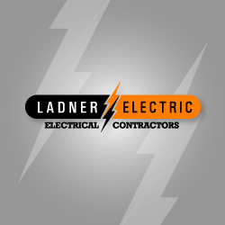
Company Name: Ladner Electric

Description
As Ladner Electric requested, this logo design is clean and straight-forward, easy to read, reliable, and sharp. It is bold enough to stand out on their trucks, which was one of their prerequisites, but also subdued and tasteful, to convey a feeling of experience and safety. The lightning bolts are cleverly used to divide the design in half, creating a separation between the two words of the company name.
