PayPal’s new logo design no longer resembles a car park icon
May 8th, 2014
In a recent brand survey conducted on behalf of money exchange giant PayPal, findings indicated that most people recognise PayPal as a brand and something to do with online money, but few were sure of what, exactly, PayPal actually does…
And so with the launch of a new mobile payment service, PayPal has taken the opportunity to refresh its image with a new logo design.
Designer Yves Behar commented: “It [the old logo] scored high in trust, but it didn’t score high in innovation.” In fact, some critics even likened PayPal’s previous ‘single P’ to a car parking sign and felt it was confusing and lacking in imagination.

PayPal's previous icon

Generic car park logo – spot the difference?
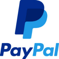
PayPal’s new design, though only relatively subtley different from the previous version, is sleeker and perkier to suggest a company that is modern and forward-thinking, despite having been around for over 15 years.
The overlapping P’s are intended to suggest the idea of connectedness in an online, mobile world (though some critics dismiss this as marketing ‘fluff’), while the brighter blue hues should distinguish PayPal from the boring grey-blue default palette of historic and stuffy financial institutions.
What are your thoughts on PayPal’s new look? Does it inspire greater brand confidence? Personally, I quite like the new design, but whether or not it will help PayPal to stand out from the crowd remains to be seen.