Mixed reviews for Colorado’s new brand identity
September 13th, 2013
A few weeks ago we reported on the innovative use of collaborative social media by the state of Colorado to create a new state brand identity. The idea was to take everyday Coloradans’ thoughts and feelings about their home state, and to use these to develop a logo that would represent Colorado on state documentation, tourism promotions, and in local business. You can read more about the project on our original blog post.
We can now reveal that the winning design has been announced.

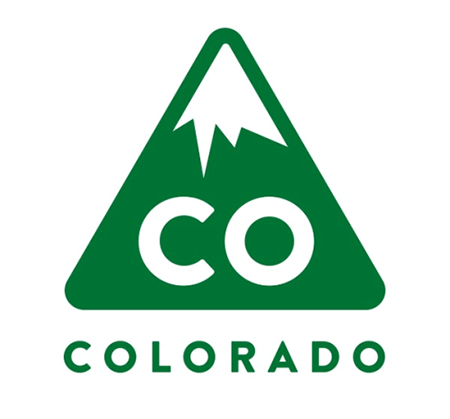
Designed by Evan Hecox, the new logo is said to represent both Colorado’s mountainous terrain and its aspirations of “upward momentum”. The green and white palette mimics that of the official CO license plate, and was found to have a strong and recognizable link with Colorado, according to respondents to a national survey.

To go alongside the logo, the new slogan “It’s our nature” has been chosen, suggesting both the strong association that Coloradans have with The Great Outdoors, and the idea that locals are warm, friendly people.
Aaron Kennedy, chief marketing officer for the state of Colorado, waxed lyrical about the new logo and its potential to “help Colorado attract talent and jobs”. He also claimed that it will “save public dollars by eliminating the need to manage individual brands for each agency and department in state government”. The reaction of the general public however, has been that of a state which is, sadly, rather underwhelmed.
Some Coloradans have criticized the new logo for being too simplistic. One resident was quoted on Fox News as saying, “next time they should just run an elementary school competition!”, while even the Denver Post ran an editorial that questioned, “how did we end up with such a pedestrian logo? …How forward-thinking is it to use our state’s postcode – CO – as a central element?” Still others have pointed out the logo’s rather unfortunate resemblance to an industrial carbon monoxide warning label – “It looks like a hazmat!” said one commenter on the Making Colorado Facebook page.
About the Author:
Although her primary niche is in scientific writing and editing, freelance writer Lisa Martin is also a creative type with an eye for design. She regularly works alongside graphic designers and as such has a keen interest in the development of logos and branding.


