Inspiration from the restroom: Meet Android logo design creator Irina Blok
October 29th, 2013
![]()
Irina Blok may not be a familiar name to most of us, but if you’re the owner or user of an Android smartphone or tablet, then you’ll certainly be familiar with her most famous design creation – the ‘little green man’.
Russian-born, New-York based Blok has, in fact, worked on design briefs from many of our favorite brands, including Yahoo!, Adobe and Visa. She also has her own clothing design company, Creative Blok. But it is the time she spent working at Google developing the Android robot for which she will most be remembered.
Now owned by Google, Android was an independent company back in 2007 and Google had just agreed to endorse its operating system as the preferred OS for a new range of mobile devices. A new logo was needed: something simple, recognizable, and in keeping with Google’s colorful, playful image. Blok’s creative team was chosen to work on the simple brief: “it needs to have a robot in it”.
According to Blok, she began the design process by looking to science fiction movies and children’s toys for inspiration, but the idea for what eventually became the well-known Android logo came from an entirely different source: a public restroom! To be more specific, Blok one day noticed the universal signs for ‘male’ and ‘female’ that typically hang on restroom doors, and immediately envisioned a robot version with little antennae as the universal symbol for Android. Cute, simple, and green, the Android robot was born.
But that’s not the end of the Android logo story. As Blok explains on her website, “Initially the logo was meant for the developer community, but it quickly became consumer facing with millions of people creating their own versions of the logo every day.” You see, since the Android platform itself is open source, meaning that anyone can modify it for their own needs, so it is with the Android logo – anyone can adapt the basic shape and design to make their own version of the little green man.
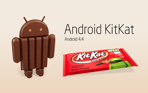
Versions of the robot that have appeared scattered about the internet to date range from simple, subtle modifications – such as the addition of a heart, a pet robo-dog, or a skateboard – to complete celebrity makeovers including Android-Superman, Android-Frankenstein, Android-R2D2 and even an Android-Spongebob Squarepants! What’s more, to celebrate the launch of Android’s next dessert-themed version release – Kit Kat, in association with Nestle – you can even now buy limited edition Android robot-shaped Kit Kats at a store near you!
About the Author:
Although her primary niche is in scientific writing and editing, freelance writer Lisa Martin is also a creative type with an eye for design. She regularly works alongside graphic designers and as such has a keen interest in the development of logos and branding.