Controversial Cape Town logo design goes ahead despite opposition
February 28th, 2014

From my own travel experience, Cape Town is a city of contrasts. As a vibrant, modern city – the second most populated in South Africa after Johannesburg, Cape Town glitters in its sunny seaside position and is overlooked by the breathtakingly beautiful Table Mountain.
There is art here, and culture, music, museums, botanic gardens and entertainment, a gaudy student drinking culture and backpacker scene, and the ramshackle yet colourful and lively township shanties. Diverse ethnic groups have made their home in Cape Town: Khosa people, Zulus, Cape Malays and white Africans of Dutch, German and British heritage to name but a few.
But Cape Town also has its dark side.
Between stops on your Long Street bar crawl you may meet any number of vagrants at varying stages of inebriation and of varying levels of threat, begging for money. While dining on fine food and drink at the glitzy waterfront, you won’t be able to help but notice a heavy police presence to keep tourist crime at bay, and evidence of poverty is everywhere. Walk down the wrong street in Cape Town, or linger too long at a red light in your car, and you may be unlucky enough to experience first hand the legacy of an African nation with a troubled history.
So it wasn’t really that surprising to me when I read, following the announcement of a new logo for the city of Cape Town, that the move was met with intense controversy.
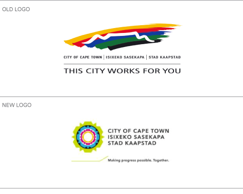
The official line on the decision to create a new logo for the city, according to Cape Town’s Democratic Alliance (DA) mayor Patricia de Lille, was to “communicate the city’s shift from passive delivery to shared responsibility”. It was felt that the old logo, with its strapline “This city works for you” implied a passive relationship between government and its citizens, whereas the new slogan, “Making progress possible. Together.” has a dynamic, interactive feel.
The city council has also recently moved away from each department being responsible for its own communications towards a central communications team, so it was felt that a new logo was needed to reflect this united front.
In this spirit of unity, the new logo is circular in shape, with the bright colours representing the wealth of Cape Town’s ethnic and cultural diversity. The shape of Table Mountain is still visible, though in a more stylised form, so as to differentiate it from the many other regional logos featuring the iconic peak.
I rather like the new design, so why the controversy?
One argument against the new logo is that it was expensive to develop. A spokesperson for the African National Congress – the majority ruling political party in South Africa but not that in control of Cape Town’s local council – commented that it was irresponsible to spend over 300,000 ZAR ($28,000 USD) on the development of a new logo for a city that has “huge service delivery needs,” especially given that there was no public consultation on the idea, let alone the design. It is estimated that implementation of the new design will run into millions of rand.
Furthermore, accusations have been made of foul play in the council’s choice of vendor for the design project, which despite being put out to tender, was awarded to jointly to two agencies. One of these, Yellowwood Future Architects, is the former employer of the council’s current director of strategic communications and branding – coincidence?
The ANC thinks so, and rumour has it that the opposition party intends to take the DA to court over the fiasco. ANC chief whip Xolani Sotashe said: “It just goes to show that if you vote DA, you will get a logo instead of houses.“
Do you agree? Is a logo to demosntrate a united local government an appropriate use of funds given the depth of South Africa’s social problems?
Although her primary niche is in scientific writing and editing, freelance writer Lisa Martin is also a creative type with an eye for design. She regularly works alongside graphic designers and as such has a keen interest in the development of logos and branding.


