Brazilian World Cup logo design sends mixed messages
July 14th, 2014 
For a dedicated football (soccer) fan, seeing your country win the coveted Jules Rimet trophy is literally The Best Thing Ever. Though my team, England, crashed out of the 2014 FIFA World Cup in the early stages, the excitement and passion of “the beautiful game” continues and many are eagerly awaiting Sunday’s final battle between Argentina and Germany.
For a contest that means so much to so many people, it’s important for the host country organisers to get the marketing right. For this year’s host – Brazil – it’s even more important given the many controversies surrounding the contest.
Brazil’s 2014 World Cup competition is the most expensive World Cup ever. With a price tag in the region of $11 billion or more, rainforest has been chopped down to make way for new stadiums, and local people are rioting over the decision not to spend this amount of money on public services instead.
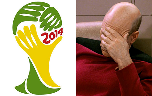
Controversy surrounds Brazil’s World Cup logo design too. The logo, entitled ‘Inspiration’ depicts three hands in the shape of the sport’s famous trophy, in the yellow and green colours of Brazil’s national flag. The design was selected by a panel of judges from FIFA and Brazil’s celebrity scene, and was chosen to represent unity, harmony and a warm Brazilian welcome – but does it represent football?
For one thing, critics have expressed confusion as to why the logo depicts hands, when hands are most definitely not allowed during the game (except if you’re Diego Maradona, the Argentinean striker who controversially scored a winning goal against England in the 1986 quarter finals with what has become known as the ‘Hand of God’).
Others have remarked upon the logo’s resemblance to Captain Jean-Luc Picard’s infamous ‘facepalm’ gesture from Star Trek: The Next Generation, but perhaps after Brazil’s 7-1 drubbing against Germany a few days ago, the logo was appropriate after all. What do you think?
About the Author:
Although her primary niche is in scientific writing and editing, freelance writer Lisa Martin is also a creative type with an eye for design. She regularly works alongside graphic designers and as such has a keen interest in the development of logos and branding..


